30+ tips to improve your iOS design workflow (in Photoshop)
I’ve compiled below some of the methods I follow when designing iOS apps in Photoshop. Many of the tips are applicable to UI design in general. Note: The shortcut keys are for Windows; Mac users, please use Cmd for Ctrl and Opt for Alt.
1. Keep the dimensions even numbered
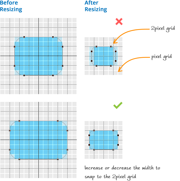
Do you design for Retina first and then downscale it to standard resolution? Keep the dimensions and distances in even numbers for the downscaled version to remain pixel perfect. How? Create a 2pixel grid and stick to it. Go to Edit > Preferences > Guides, Grids & Slices. Maintain Gridline and Subdivisions such that you get a gridline every 2 pixels. For example, keep Gridline Every 64 Pixels and Subdivisions 32.
2. Use only Normal blend mode
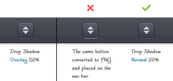
For layer effects that appear immediately on top of other elements use only Normal blend mode (e.g.: drop shadow & outer glow). Using any other mode may look good on Photoshop but probably give rise to undesirable effects when built with PNGs.
3. Change gradient color easily
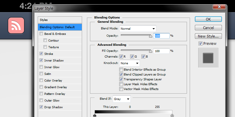
Want to try out different hues for a gradient button without changing the gradient's color stops each time? There are two methods that give exactly the same results.
Method 1: Color Overlay on Gradient Layer
- Create a Gradient Layer. Choose light grey and dark grey color stops. You can fine tune it later.
- Create a vector mask of the button
- Copy the vector mask and paste it on the gradient layer (Select the vector mask > Ctrl + C > Select the gradient layer > Ctrl + V)
- Click Layer > Vector Mask > Current Path.
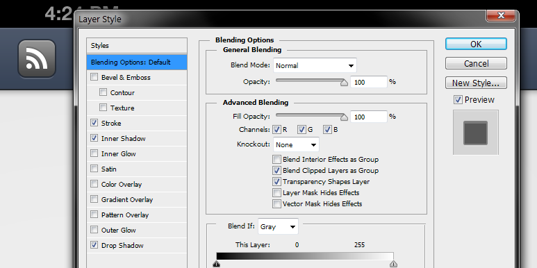
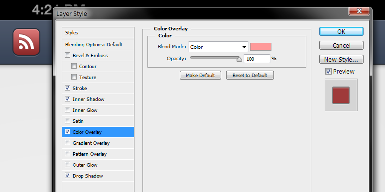
- Go to Blending Options and apply Color Overlay with blend mode Color.
- Now you can try out colors just by changing this color.
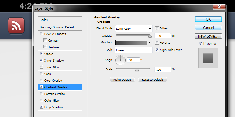
Method 2: Gradient Overlay on Solid Color Layer
- Create a Solid Color Layer with the color that you want.
- Same as the previous method
- Same as the previous method
- Same as the previous method
- Go to Blending Options and apply Gradient Overlay with blend mode Luminosity.
- Now you can try out colors by changing the color of the Solid Color Layer.
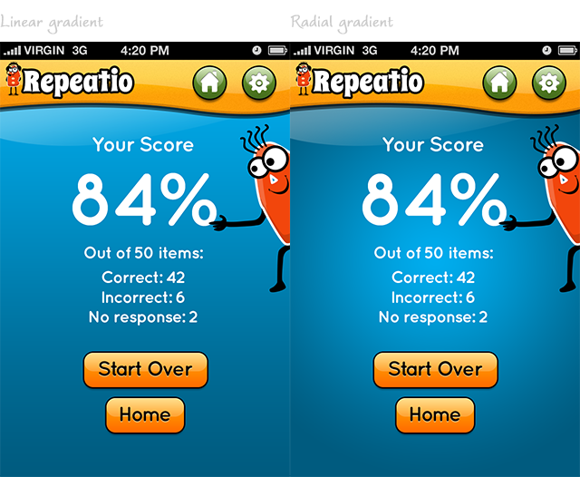
4. Use radial gradient for more depth
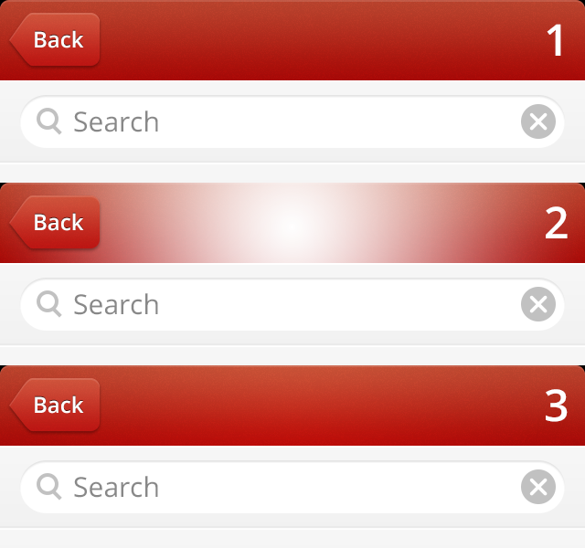
For navigation bars use an overlay of radial gradient to make it a little more interesting.
Method 1: Radial Gradient Tool
- Create new layer above the navigation bar layer
- Copy the vector mask of the navigation layer to the new layer (Ctrl + Alt + Click and hold the navigation bar layer> Drag and drop it on the new layer)
- Select Radial Gradient tool (foreground to transparent with white as foreground)
- Draw a gradient from the center to the edge
- Change the Blend Mode to Overlay and set the opacity to 25%
Method 2: Bevel & Emboss
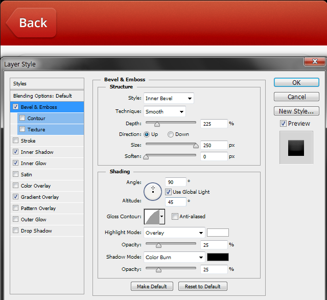
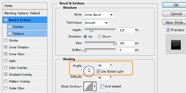
You can use Bevel & Emboss too. Settings as shown in the screenshot. Play with the settings to achieve the result that you want. Usually such effects look better when kept subtle.
5. Reshape shadows for even more depth
Photoshop allows you to separate the shadow (and any other layer effect) from its layer. This allows you to independently manipulate the shadow.
- Go to Layer > Layer Style > Create Layers
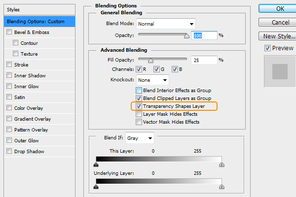
- Convert the layer into a Smart Object so that you can edit it later (Go to Blending Options > check Transparency Shapes Layer. Right click the layer > select Convert to Smart Object)
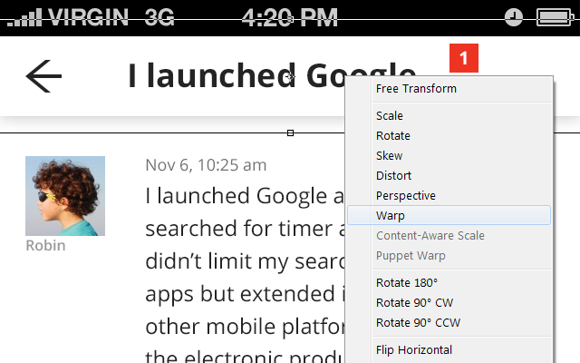
- Press Ctrl + T > Right click and select Warp
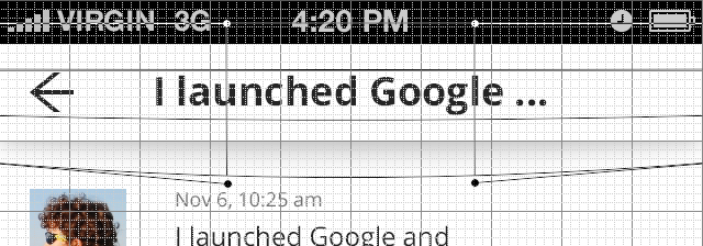
- Click and drag the handles down to change the shape. The handles don’t snap to grid. But use grids to guide you and repeat it to the other handle
- Nudge the layer up till you get the effect as shown in the screenshot.

6. Easily add subtle texture using Inner Glow
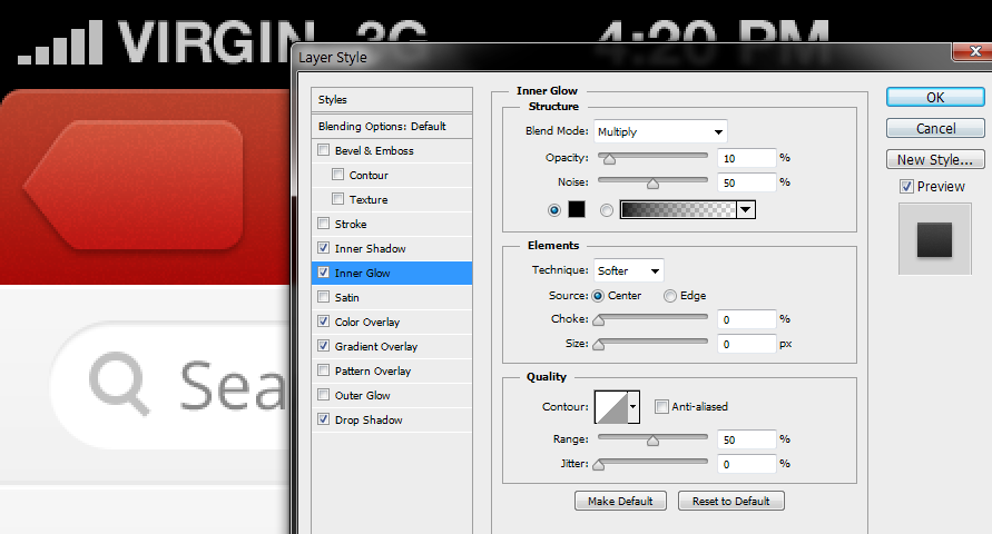
Add subtle texture fast with Inner Glow using the settings shown in the screenshot below.
7. Hide path selection
One of the annoyances in CS6 is that when you select a shape layer the shape becomes visible. This blocks the view when working with the layer, for instance, when setting the layer's blending options. You can press Ctrl + H to hide all extras (path, grid and guides) but what if you want to hide the path alone? Press Ctrl + Shift + H.

8. Snap to Pixel Grid for pixel perfect shapes
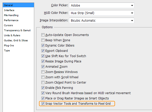
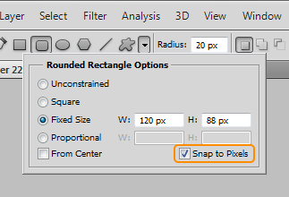
This is one of the best improvements in CS6. Press Ctrl + K to open Preferences and check Snap Shapes and Transforms to the Pixel Grid. In CS5 there is an option to snap shapes (but not transforms) to pixel. Enable it in the Geometry Options as shown in the screenshot.
9. Use spreadsheets to calculate thumbnail dimensions
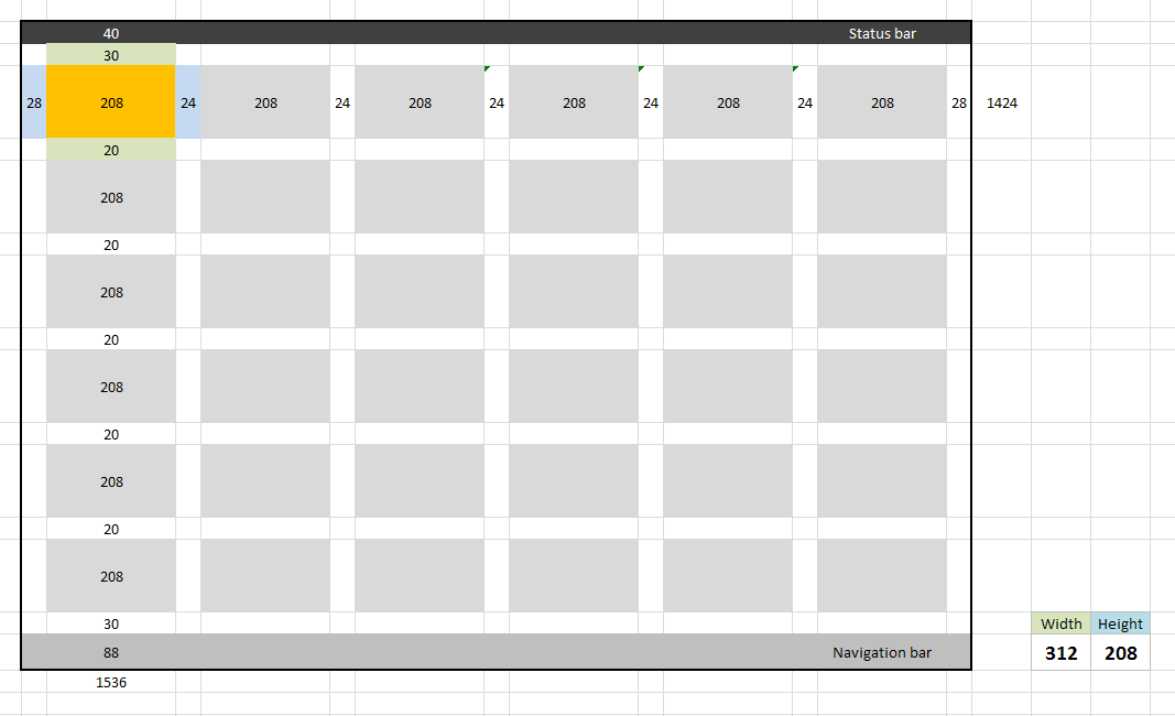
Creating an iPad app that shows a lot of thumbnails? Use a spreadsheet program to calculate the dimensions of the thumbnail and spacing between them. Spreadsheet does the calculation for you and shows in real-time how changing one dimension affects the dimensions of the other elements and whether they’d fit the screen or not. Download the Microsoft Excel spreadsheet that I created while working on an iPad app (the file contains 4 spreadsheets, for 6x6, 5x5, 4x4 and 3x3).
10. Automate assets export
If you have to create image assets, use Export Layers to Files found under File > Scripts
11. Stop copy from getting suffixed and layer effects getting expanded
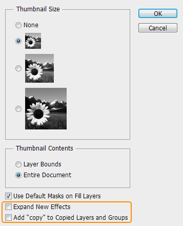
Annoyed by the word 'copy' getting suffixed to the name of the layer each time you duplicate a layer? Annoyed again when the layer effects expand each time you copy & paste a layer effect? Uncheck them in the Layer Panel Options.
12. Rotate in 15° steps
While free-transforming, hold Shift to rotate the object in multiples of 15°.
13. Save styles
Save repeatedly used styles into the Styles palette to avoid copying and pasting them each time.
14. Move layers between two open documents
Press V to select Move tool > Select the layers you want to move > Click inside the document (not the layers panel) and hold > drag the cursor to the tab of the destination document > drag into the document and release the button.

15. Set the Global Light at 90°
Highlights and shadows and other layer effects look best when the light source is at 90°. To avoid changing it each time, check Use Global Light in one of the Blending Mode Options (Bevel & Emboss, Inner Shadow and Drop Shadow) or go to Layers > Layer Style > Global Light
16. Name layers as you create
Naming layers before sending it to the developer could become a job that you dread. So, form a habit of naming each layer as and when you create it.
17. Use custom shortcuts
Notice which tools and tasks you use most and create custom shortcuts for them. For example, if you find yourself renaming a lot of layers while handing the file to the developer, create a custom shortcut. I use the function key F2.
18. Use radial gradients
Even linear gradients can sometimes look a little flat. Try using a radial gradient for background. Use inner glow to accentuate it.
19. Strive to do things non destructively.
Follow a non destructive workflow by using Smart Objects and Adjustment Layers. This will save you a lot of pain when you find yourself having to repeatedly edit the same thing.
20. Create a copy of the file before you make a major change
This will again save you a lot of pain that comes with saving the changes that you don’t want to save and accidentally closing the file before undoing the changes.
21. Use shortcut for filling Shape Layer and Text
You may know that you can use Alt/Ctrl + Delete to fill a layer or a selection with foreground/background color. The same shortcuts work for shape layers and text too.
22. Quirk in Photoshop - Drop Shadow & Inner Shadow size
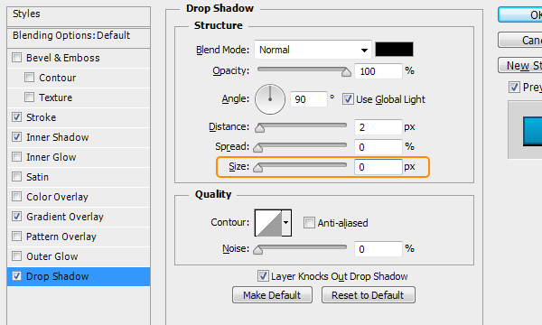
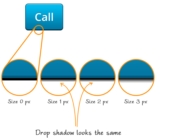
Remember the tip #1 about maintaining even numbers for dimensions and layer effects? You might have set everything in even numbers but still you might wonder how the button is at an odd height. The culprit behind this is a quirk in Photoshop's drop shadow size. The size of the shadow remains the same for 1 px and 2 px, illustrated below.
23. Turn on Smart Guides for perfect alignment
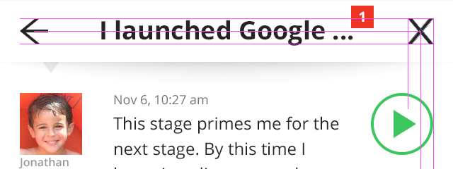
Let Photoshop suggest you alignment of the elements. Turn it on at View > Show > Smart Guides. Once you start using Smart Guides you'd never go back.
24. Use Layer Comps to view different show screens in the same file
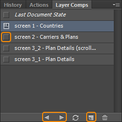
Do you create all of the screens of an app in a single PSD file and keep turning on and off layers to view them? Layer Comps is here to help. To make the Layer Comps panel visible go to Window > Layer Comps. Once you create a screen create a layer comp by clicking the New Layer Comp icon at the bottom of the Layer Comps panel. This layer comp contains the visibility and position information of the layers that make this screen. Now you can create the next screen with the sames layers by changing its visibility or position and save it as another layer comp.
By using the same components to build various screens you keep the number of files and file size to the minimum. And, the developer and you could view the screens just by clicking the tiny box in front of the layer comp's name or cycle through the layer comps by clicking the Previous/Next arrows at the bottom of the panel.
25. Preview your design on the device
Designs that look good on your desktop display may reveal issues when seen on the actual device. So, keep previewing the design on the display frequently. For Mac there are tools like LiveView, Scala Preview, etc. For Windows there are WiFileSync and Photoshop Display. I use Polkast that is available for free. It allows you to view your desktop files on your iOS device via wi-fi.
26. Be consistent in icon design
While selecting the icons see that they are consistent in style and size. Read why consistency is important.

27. Send full sized preview to clients
Clients like to see the design on their devices. So, consider sending them a full sized PNG of the design comp.
28. Avoid pixel perfect wireframes
Don’t spend time on creating beautiful wireframes on a wireframing software. I find clients are ready to review sketches once they understand it could save them time. Explain how doing away with wireframing could reduce the overall timeframe of the project and once they agree send them photos of the sketches. Don’t forget to make the sketches more legible.
29. Design for Retina and then scale down to standard size
There used to be discussions on whether to design for 1x and upscale it to 2x or downscale from 2x to 1x. Phones of 1x sizes might get phased out in a couple of years and you’ll be left with only Retina. So, better start designing for Retina first. By this way you can add retina-specific details earlier in the design.
30. Create a repository of icons
Whenever you create vector icons for toolbar or tab bar save a copy of the icons (with the shapes intact for easy editing) to a single PSD file. By doing this, you don’t have to search anywhere when you want to reuse the icons later. This practice formed the basis of creation of my ikonic.
31. Use a batch renaming software
Use a batch renaming software for adding or removing @2x to the files. I use a free software called Bulk Rename Utility.
If you found the tips useful share this post.
Get notified of new posts
I write only when I really have something to say; when I do so I’ll send one email and that’s it; no spam, no bullshit.