In search of the perfect radius
Few weeks back, I happened to read Chris Coyer's article on nested border radii, which spurred me to do a study that I long wanted to do.
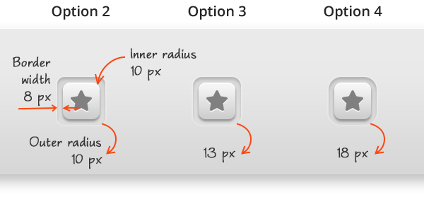
In the figure below, which button looks right? Had you ever had to design such a button or in general, a rounded rectangle nested inside another rounded rectangle and wondered what should be the inner radius for a given outer radius or vice versa? That is what we're going to find out.

Four ways to create nested rounded rectangles
For instance, if you have created a button inset and wanted to create the button, you can either,
- Use a radius that just looks right
- Use the same radius for both the rounded rectangles
- Duplicate the outer rectangle layer and free-transform it to create the inner rectangle
- Set the Inner Radius to Outer Radius minus Border Width
Which method to choose?
Given the gullibility of our eyes I wouldn’t rely on option 1. It's obvious from the image above that option 2 doesn’t work. Options 3 and 4 look like they have a method behind them. So, I set out to choose the right one among them.
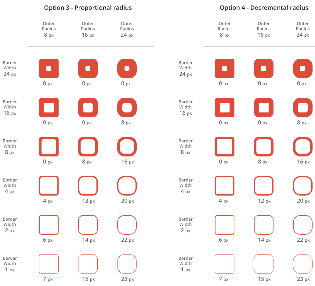
- For the outer rectangle I chose 1 width, 3 outer radii and 6 border widths and drew the 18 rectangles as shape layers in Photoshop
- Created the inner rectangle by a) free transforming a copy of the outer rectangle (for option 3) and b. applying an Inner Stroke of size equal to the border width (for option 4)
- Tabulated the results
Option 4 is the one
It is clear from the results that option 4 works well for all the border widths, from 24 pixel to 1 pixel. And yes, Photoshop goes by it too. So, the formula is simple: Inner Radius = Outer Radius - Border Width
The search continues
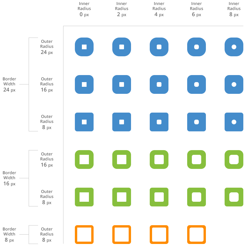
Does the search end here? Well, sort of but not entirely. Did you notice how in cases where the border width is greater than or equal to the outer radius the inner radius is zero and the button is simply a sharp square? Does it look good? Is it possible to improve it? Wouldn’t it look better if the corners are slightly rounded?
Enter the next phase of the study. In Mechanical Engineering parlance this rounded portion is called fillet and the machining operation that carves out a fillet is called filleting (I hold a Bachelor's degree in Mechanical Engineering :)). In our case, does filleting make the design better? If so, what should be the fillet radius and how should we calculate it?
Filleting improves the design
To find if it makes the design better I chose those square cases and tried a fillet radius of 2, 4, 6 and 8 pixels. The below table shows the results. You can see that filleting, by a particular fillet radius, does improve the design.
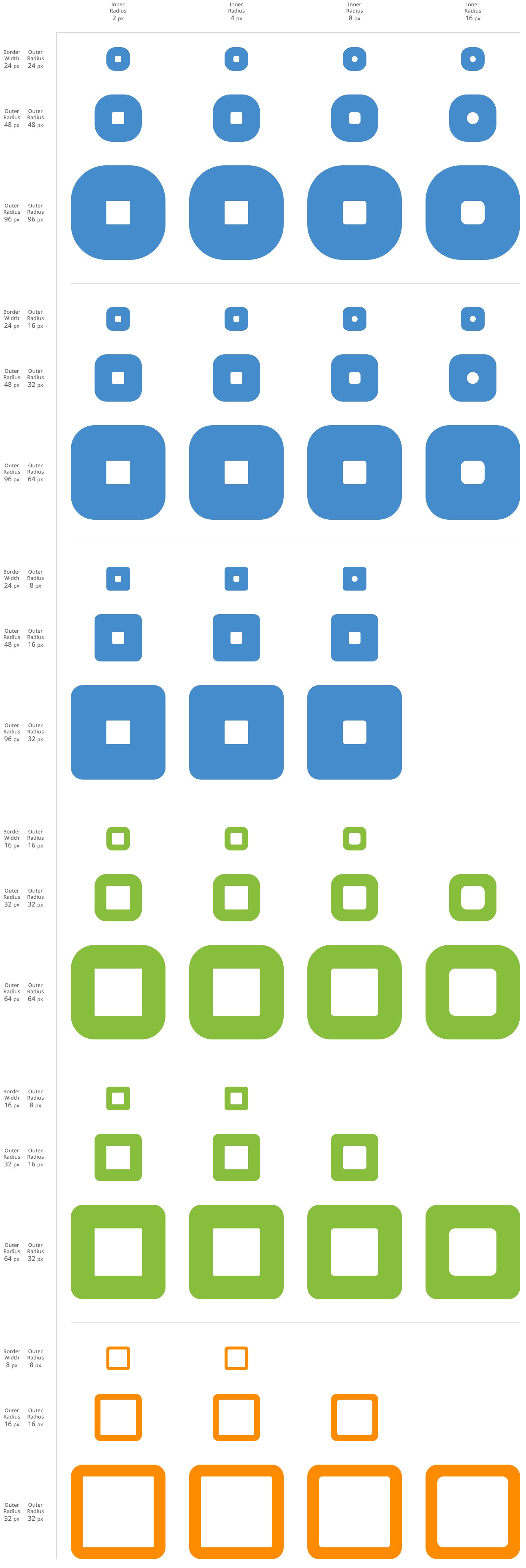
I wanted to see if the radius that works at smaller sizes works at bigger sizes too. So I tried doubling and quadrupling the button and tabulated the results. The best looking fillet radius seems to increase with the button size.
What is the formula for fillet radius?
I wanted to find if there is a formula that determines the best fillet radius. Is it possible? Yes. If I say I’ll give you $4 if you give me $2, $12 for $6 and $50 for $25, you can easily guess the formula. Mathematically, you can do this by plotting the data (2-4, 6-12 and 25-50) on a graph and find the formula of the line or curve that connects the data points, using a process called Curve Fitting.
Which data pair to choose? One is the fillet radius; fillet radius that looks best to me (this is unscientific, I know but we're out of that territory now). The other? It seems it could be the outer radius but who knows, even border width could play a role. So I plotted two graphs, one to find out how the inner radius varies with outer radius and the other to find out how it varies with border radius. Below are the graphs. Note: The results may vary if you repeat the experiment by choosing the fillet radii that look best to you because in some cases it is not clear which fillet radius looks the best and thereby you may choose the adjacent fillet radius.
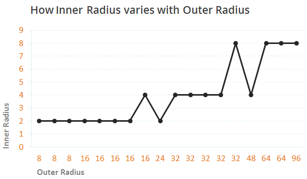
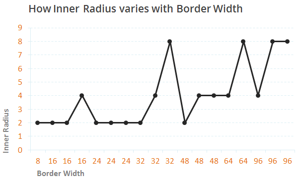
The inner radius seems to increase with both the outer radius and the border width, but not smoothly. As far as I know, the curve fitting exercise could yield a meaning formula only when curve follows a pattern. The pattern could either be a straight line, a parabola, a sine wave, etc. But the plotted curve is so jagged that I doubt there is a pattern to it.
I did the whole exercise based on my rusty mathematical knowledge. I might’ve missed something or I mightn’t have plotted enough points. If somebody who's better informed takes up the exercise and try to plot more points I’ll be happy to see the results. As of now, it seems, after all, we’ll have to rely on our eyes to find the best fillet radius. Not a comfortable position to be in but that is where we are. But, note that we’ve already established the formula for inner radius. It is the formula for fillet radius that is playing hide and seek.
Summary
The next time you want to create nested rounded rectangles follow this to get the best results:
- Inner Radius = Outer Radius - Border Width
- If the inner radius = 0, fillet it. Find the best fillet radius by eyeballing (roughly, for outer radius less than 100 px, the best fillet radius might be anywhere in the range of 1 px to 15 px)
Get notified of new posts
I write only when I really have something to say; when I do so I’ll send one email and that’s it; no spam, no bullshit.