Why consistency in icons is important and how to achieve it
Consistency is one of the design principles that users naturally expect to be followed in a design. By making your design look and behave consistently you make it more understandable, more learnable and thus more usable. In fact, the whole point of platform-specific Human Interface Guidelines is to make your app consistent with other apps in the same platform, so that users can readily understand your app and don’t have to learn it anew.
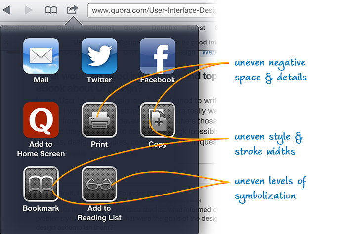
Most probably, you’re already making your designs consistent. But how far do you take it? By making your designs visually consistent at a deeper level you could make your app a lot more professional and reliable. For an example of design that’s inconsistent at a subtler level, look at the action menu of Safari on iPad, running iOS 6. Each time I use it I couldn’t stop wondering how it could’ve made its way into the UI. Can you spot the problems with the icons?

- the icons are flashy and unnecessarily detailed
- the metallic styling and thick borders take away the focus on the symbols
Apart from these flaws the following inconsistencies are glaring:
- print, copy, bookmark and reading list icons are elaborately styled while the mail, twitter and facebook icons look plain
- within the last four icons the stoke width is not uniform
- the negative space varies substantially
- print and reading list icons look more true to real objects while the other
- two look more symbolized
- print and copy icons are solid while the bookmark icon is outlined
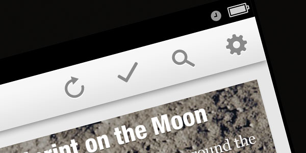
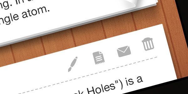
Contrast that with the consistency of the icons found in the screenshots below. The icons are part of the ikonic set. The uniform stroke lengths, uniform surface area of the icons and the uniformly smooth rounded corners make them visually consistent at a more detailed level. By using icons that are this consistent you clearly communicate to the user that you’re a professional who cares about user experience at far finer levels.


I’m not advocating pedantic adherence to consistency by making each and every stroke width uniform or of same spacing. But by being aware of them and by making them more consistent you bring the app closer to the heart of the users.
So, the next time you design your app see that the icons are of uniform size and style and look part to the same set.
Get notified of new posts
I write only when I really have something to say; when I do so I’ll send one email and that’s it; no spam, no bullshit.