Design lessons from Gmail web app
With iOS's impressive adoption rate this question is really silly and the answer is of course, "yes". But, many developers seem to be of the opinion that updating their apps to iOS 7 means redesigning them to look like Apple's stock apps. In that sense the answer is, "not necessarily".
The simple of act of checking emails became a slog a couple of weeks back when Google implemented the latest design of Gmail iOS app into Gmail web app. It looks pretty at a distance but when you actually start using it you’ll find that besides few minor slippages it has got one basic problem - the content is not readable. The design is suboptimal at best. I want to use this opportunity to convey some of the design lessons it provides and walk through a minor redesign that incorporates those lessons.
Lesson 1: Provide enough contrast
For an app whose primary purpose is to allow users to read and write contrast is first and foremost design principle that should be followed. But that is exactly what Gmail fails to do. Jason Cornwell, lead designer for Gmail, tells,
We spent a lot of time with typography to make it feel light and clean, and not like a burden.
Really, they made it too light and clean that it feels like a burden. Though there is ample contrast between the read and unread messages there is not enough contrast between the read messages and the background because of the lighter weights of Helvetica Neue and the lighter shades of grey they are set in. Consequently, they are too thin and light to be readable. Try it for yourself: Set the brightness of you phone at a comfortable level; hold your phone at around 12 in (30 cm) from your eyes and try to read the read messages in your inbox screen. See what I mean?
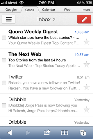
Why did Google design it so?
Cornwell's words sound like a direct answer to the question:
If we just design [Gmail] to look like an Apple app, we’ve sort of failed. We want it to have some personality that’s its own.
However, there might be a more sensible reason behind this - they might’ve thought once you read the messages you don’t go back to them so often as to make them readable enough. But what if you do?
How can you improve the design?
You can make everything readable and still differentiate the read and unread messages by creating contrast in more than one way. You can create contrast by varying any or all of the following.
- font size
- font weight
- textbrightness (aka. lightness)
- text color

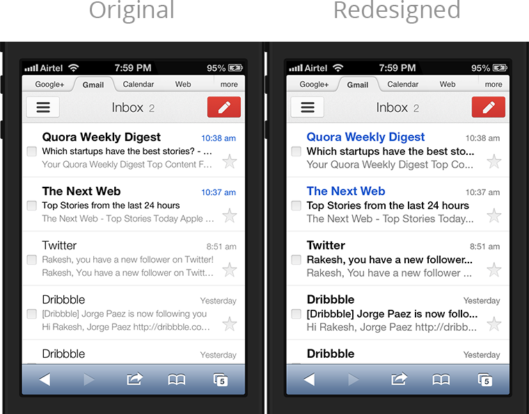
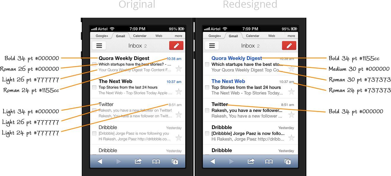
I increased the size and weight of the font, darkened the text and shifted the blue color from the unread message's time stamp to its sender to arrive at this:

Though to my eyes the redesign looks better than the original and to some of you it may not be so, how it looks is only as important as how it works. The original looked good at the expense of readability while the redesign achieves a balance between the two.
Message screen can be improved too
Going from the inbox to the message screen you're again met with small text. It's not as unreadable as the light text in the inbox but improving it would make reading more comfortable.
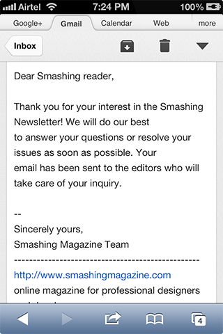
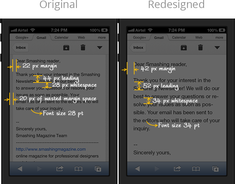
Though this time just changing the size alone would suffice, there is one more thing you can do to better it - make it more minimal. The white message layer floats above the grey background, complete with shadow, forming a 20px grey border on either sides. One surefire way to make your UI minimal is to remove such extraneous borders and shadows. It's quirky that the Gmail app, with its affinity towards minimalism, didn’t choose to do so; maybe it's part of the personality that Cornwell mentioned.
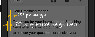
Apart from being a stylistic choice, removing the borders would increase the margin, which would allow our eyes to flow smoothly from the end of one line of text to the beginning of the next line.
How much margin is enough?
While in print design margins usually runs greater than an inch doing so in mobile design would leave a lot of unused space on either sides. So, we can base our decision on another property, the gutter width.
In any layout where text is laid out in columns the width between the columns, called the gutter width, matters for readability. Too close the columns look like a single line; too wide they look detached; keeping it equal to or a little more than the leading (space between two consecutive lines of text) looks right. The reasoning is that the space between the columns should be more than the space between the lines so that our eyes don’t get confused as to where the next line starts.
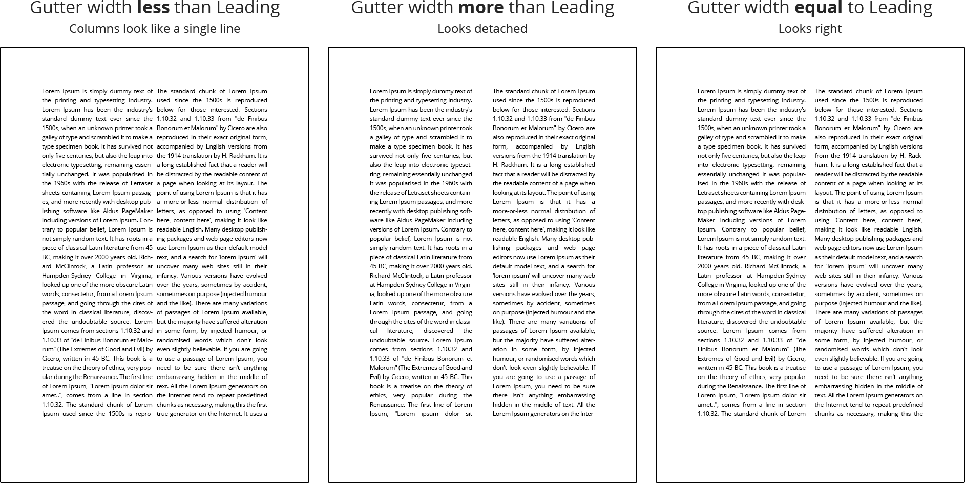
Carrying it over to mobile design where text is laid out in single column we can consider the margin as gutter width and follow its convention in setting its size. That is, the margins should be at least equal to the leading. As a bare minimum it should at least be a little greater than the whitespace between the lines. But in Gmail app the effective margin size is half that of leading and also less than the whitespace.
The redesigned message screen
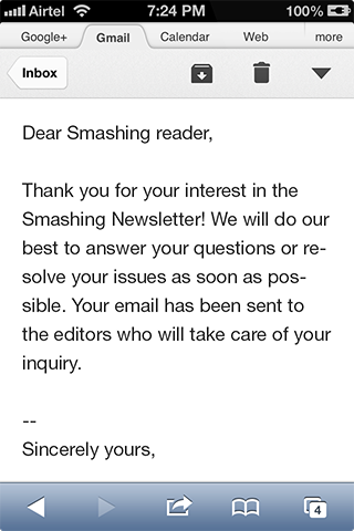
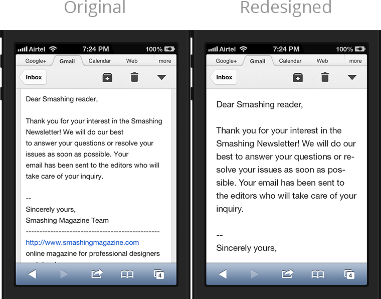
Taking all these into account, I redesigned the screen by increasing the font size, corresponding leading and the margin. The margin is still less than the leading but it is at least bigger than the thick bands of whitespace between the lines.
Lesson 2: Be consistent within your app
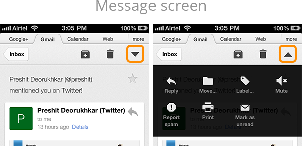
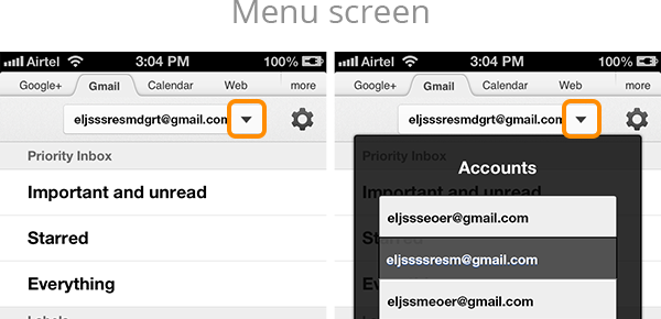
Users expect your app to behave consistently. In Gmail's message screen when the more actions menu opens the arrow icon changes direction. But the same doesn’t happen with the username button in the menu screen. This might be a nitpicked detail but in design details matter.
Lesson 3: Be consistent with other apps
After using a device for some time users learn its conventions, get used to them and expect your app to follow them too. That is, users expect your app to be consistent with other apps.
Gmail is inconsistent in two cases. In the popover case we saw above users expect to dismiss the popover (non modal popover, in iOS parlance) once they tap anywhere outside it, because it is something they’ve gotten used to. But it doesn’t happen in Gmail; you have to tap the same button again to dismiss it.
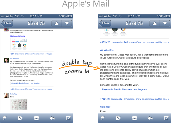
Next, when a message is zoomed out, as in the screenshot shown below, users expect double tapping on a text passage to zoom into it (the screenshot of Apple's Mail app illustrates this). Again, Gmail doesn’t do it.
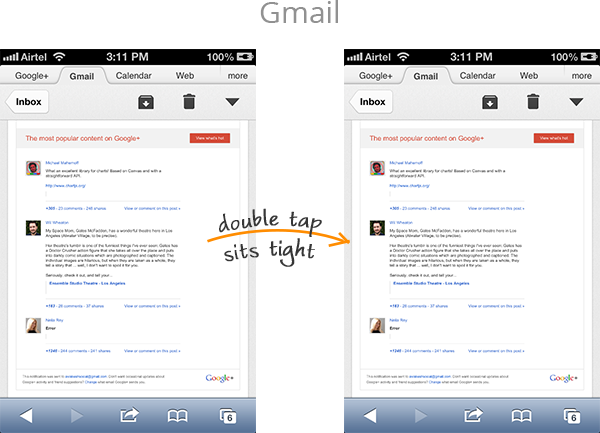
Such minor inconsistencies could easily build up into a major annoyance. The purpose of design guidelines is to bring consistency across all apps. Unless you’ve confirmed by user testing that you're considerably improving the user experience by overriding the guidelines you're better off following it.
To conclude, there might be many reasons for why Gmail was designed the way it is, some may even be valid from a perspective that I didn’t consider. But, at the end, for an average user it is not as usable as he’d like it to be. If you really want your app to be regularly used by your users try to make it usable as much as you'd try to make it pretty. Hope Gmail has given you some good pointers.
Get notified of new posts
I write only when I really have something to say; when I do so I’ll send one email and that’s it; no spam, no bullshit.