Dittory
Designing a personalized apparel discovery experience

Online apparel shopping can become a tiresome experience because of the tens of thousands of choices. Buyers want more choices but when given those choices they fatigue and may even opt not to buy. We simply don’t want to get paralysed by choices. Attribute filters help narrow down the choices but it’s a demanding process, one that constantly requires user intervention.
How nice would it be if an app shows only the products that you would like, ones that would fit you and to sweeten the deal, shows products not only from a single store but from all of the major stores? That’s exactly what Dittory aims to do. It learns your taste from explicit choices you make while using the app and use this information to narrow down products. The founder of Dittory, Chaitanya approached me with this idea and I immediately agreed to work on it. My job was to design an app that understands users’ tastes, without getting in their way and shows products that fit their tastes.
Design Principles
Going along with the underlying theme of Dittory I had two major principles guiding my design choices.
- The user should never be paralysed by choices.
- Apparels are visual. So, make the exploration visual; every product listing and choices should emphasize visuals.
Discovery of products
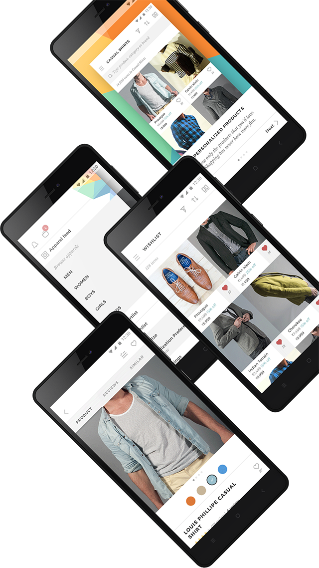
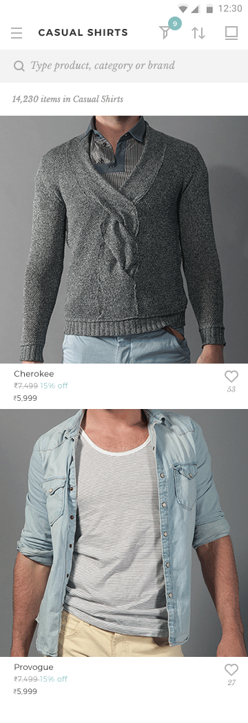
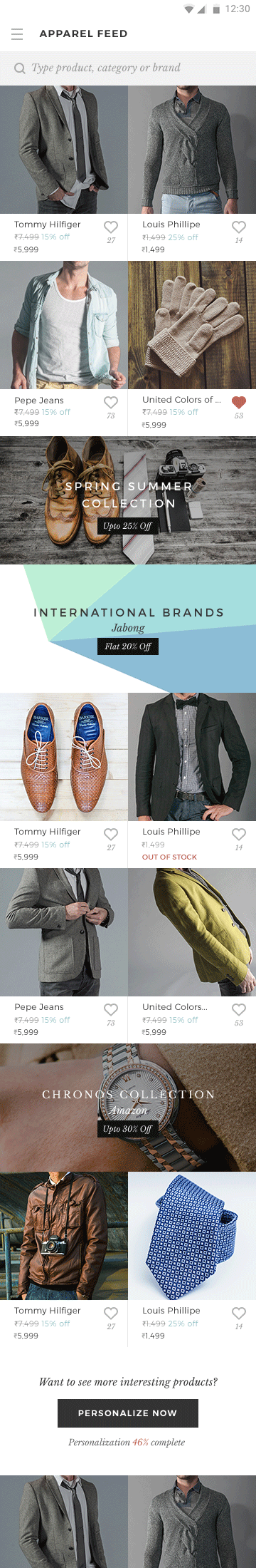
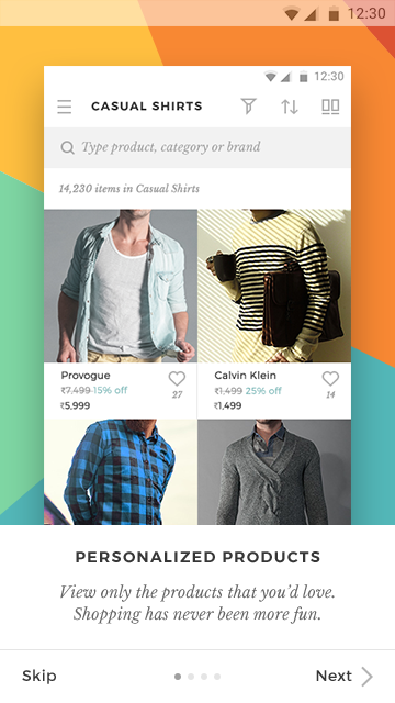
There are two major components to Dittory: discovery and personalization. Both are heavily intertwined with each other. On starting the app a user lands on the live apparel feed, where products are shown based on his interests. Browsing the feed becomes all the more interesting because it allows for serendipitous discoveries of products closely matching users' interests. The feed is also how the app learns a user’s tastes day-to-day, when she 'likes' a product.
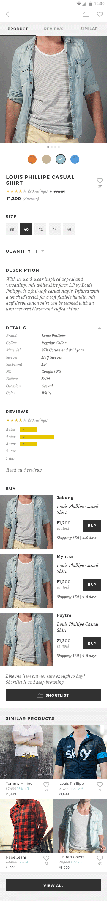
I kept the feed simple to give prominence to the products. Only two types of items appear in the feed and in a consistent style: products and offers/announcements. The products occupy half or full width and the offers cover the entire width. To make more space for the product photos I made them bleed to the edges. This also gives the app a modern, minimalistic feel. Only the bare minimum product information is shown, along with the like button.
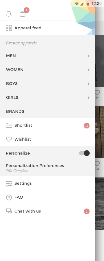
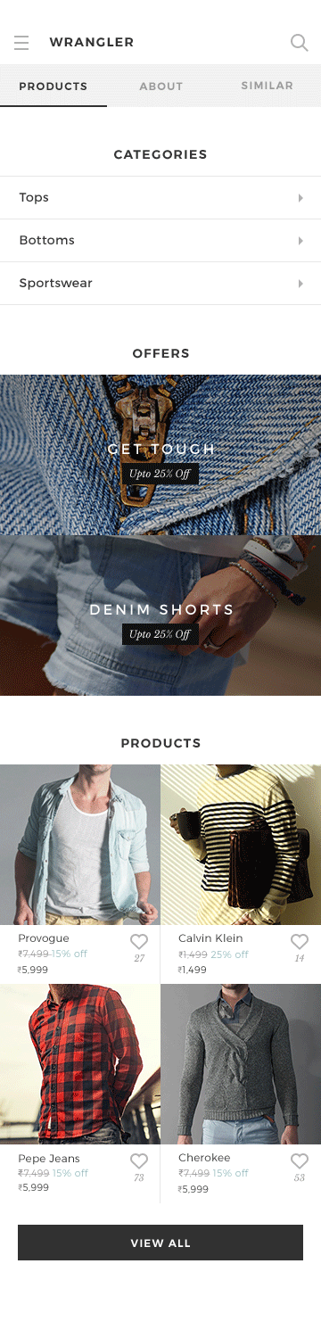
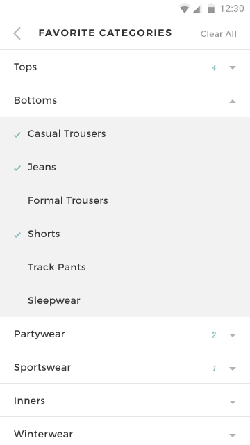
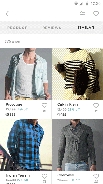
While the feed is a more fun way to discover products, on some occasions a user may want to browse all products. So, I provided a quick way for them to disable personalisation, in the navigation drawer. I kept the apparel categories shallow so that it’ll be easy to navigate between them. Wherever there are more options, such as brands, we provided search functionality. Once a user clicks on a product thumbnail he’s taken to the product details page where he can explore similar products.
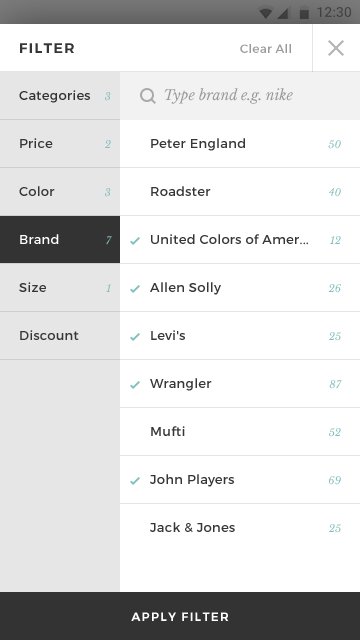
There are the usual filter/sort options only here all those options are always turned on by default, according to a user’s personalization preferences. Of course, a user can always change the options while browsing the products.
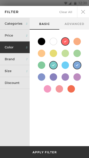
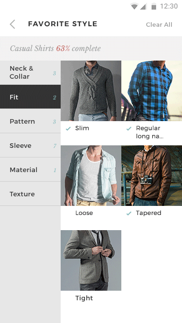
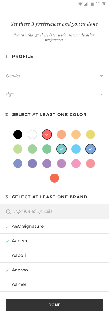
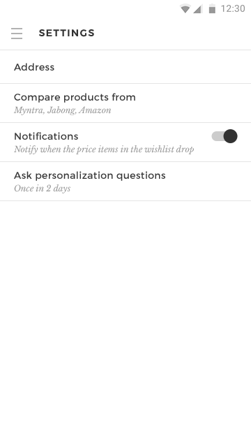
One of the important differentiators of Dittory is the ability to filter products based on thousands of specific shades of colors. While some users may prefer this level of granularity most of them would like to select few basic colors and see products closer to those colors. I provided a basic color picker for these users and an advanced color picker for those who want more control. In the advanced color picker a user can select one of the basic hues and then select the shades pertaining to that hue.
Personalization
Personalization is at the heart of Dittory. The more a user personalizes the more accurate the products would match her tastes. Personalizing is still work and users are averse to anything that resembles work. So, I had to find ways to encourage them to personalize.
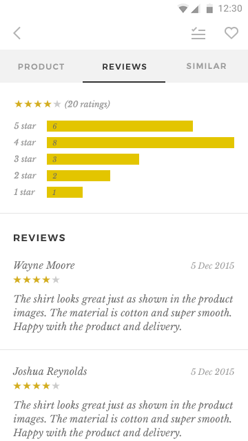
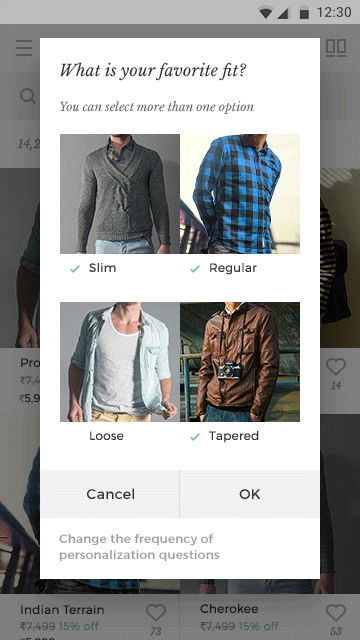
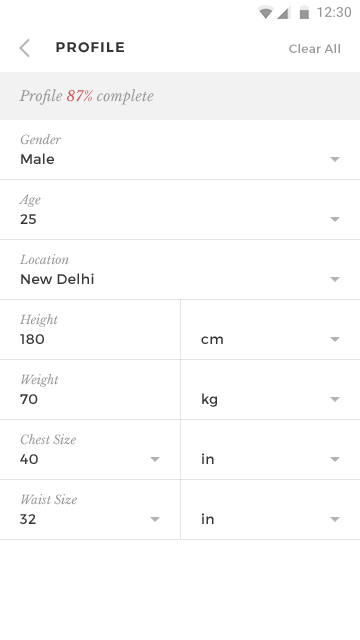
Dittory learns users tastes in two ways: The first is when a user adds items to wishlist. Liking a product is one of the natural actions of a user and so I only had to place a like button to get them to do it. The second way is to make a user proactively enter personalization information under settings. It includes users’ body measurements, favorite colors, style, brands, etc. We have to constantly prompt them to personalize and do it as non-intrusively as possible.
We use 4 ways to prompt users to personalize:
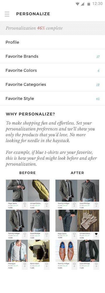
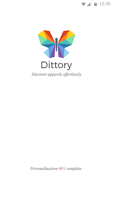
- By showing an overall personalization score wherever possible. I showed it in the launch screen where it’ll really catch the eye of the users as they have nothing to do but look at the screen while waiting for the app to load; and in the navigation drawer. I also showed the percentage completion of individual categories in their corresponding settings screens.
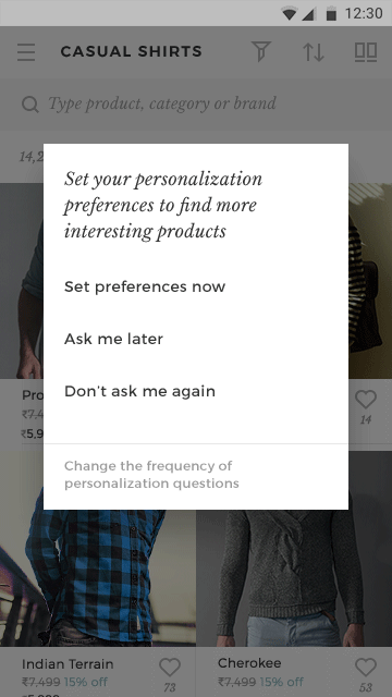
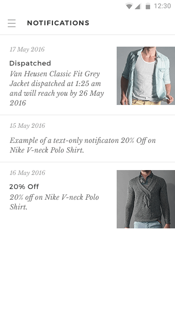
- Messages interspersed in the feed and product listing.
- Toasts (messages that appears from the bottom of the screen and disappears after a timeout)
- Pop-up dialogs: This is an intrusive method and we use it less often. We had to resort to it because personalization is the very essence of the app and has the biggest impact on the users’ experience; if a user didn’t personalize at all he can’t enjoy the core benefits of the app—in many ways, design is about finding a good balance between opposing interests.
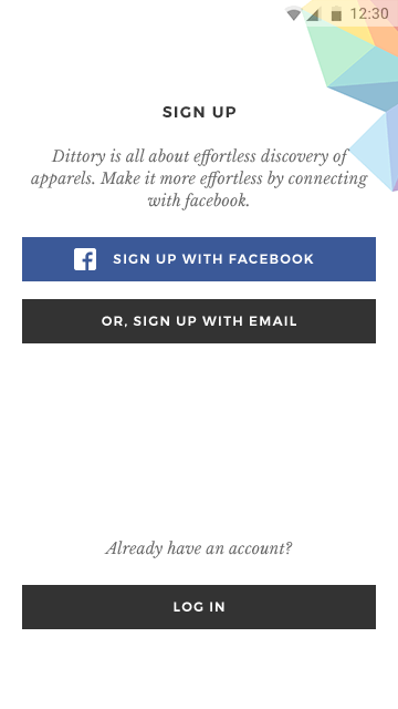
Onboarding
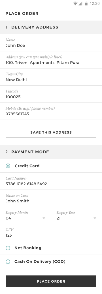
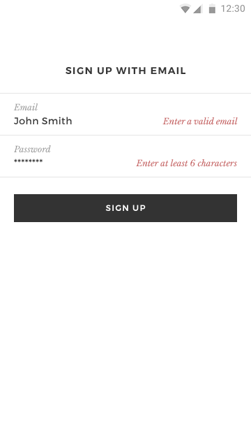
Signing up to try out an app is a barrier between the users and the app. Usually, it’s better to allow them to explore the app without signing up and ask them to sign up only when it’s indispensable for the working of the particular feature the user is trying out. Here personalization being the core of the app experience we had to ask users to sign up upfront and also answer at least a few basic personalization questions. If the users sign up using facebook we access the information from facebook and they can move on without setting up personalization.
Visual design
To give prominence to the products in the product listings I used a soft color scheme throughout the app but without compromising readability. The app being in the apparel space I wanted the products to add color to the app. So, I used a white–grey palette with colors limited to indicate selection (check marks and radio buttons) and notifications (badges, error message, etc.).
The team already had a logo in place when I went on board. The logo consisting of a set of colorful polygons that forms the shape of a butterfly suits the nature of the app very well. However the colors looked limited and didn’t depict the colorful nature of Indian apparels very well. So, I reworked the colors and we finally settled with the existing one. The colors are arranged according to the hue values, just like a rainbow, which makes the logo look less jarring and more pleasant. It has more depth compared to the flattish original; some shades are lighter and some are darker and they are evenly arranged, which makes the logo a little more interesting.
Client Feedback
One of the concerns we had was whether the designer would understand how different users might want to explore and use our app. While we had internalized this over the many months we spent poring over consumer data, we weren't sure if the designer would recognize and appreciate the differences. Getting the user flow and activity flow was as important as getting the aesthetic right. Rakesh’s work is obviously lovely to look at. But what really impressed us is how he did an excellent job of taking our brief, diving in further with his own research, and capturing what we had in mind.
It was Rakesh’s nuanced understanding of user experience and the clarity with which he charted out the use-cases and potential problems. We found quite a few designers who were great in the visual aspect of work, but Rakesh was the only one who combined clarity in design thinking with beautiful and clean execution.
Rakesh helped us clarify our own thinking in how the user should experience the app. Judicious use of space and display of information are especially important on smaller screens. While we appreciated that, it was Rakesh who helped create a design that adhered to this important principle without sacrificing in the looks department.
The two most significant improvements that have resulted: Greater clarity in how the user would interact with different elements in the design, and an enhanced appreciation for how the interface can influence user decisions.
Have a conversation with Rakesh and gauge how well he understands your requirements, and what he thinks are important ideas that should be captured in your design. That should convince you that he really does get design in ways most don’t!