Wordset
Setting the stage for collaboration on an online dictionary.

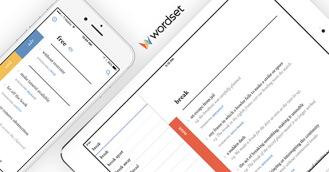
Wordset is an online, collaborative dictionary that’s available on the web and iOS. It’s similar to Wiktionary but has a more structured way of capturing information, easier to contribute and every change is vetted by the community through a proposal system.
Wordset is created by Hampton Catlin (the inventor of Sass) and Michael Catlin. It started out as a branch project of the Dictionary! app that Hampton built long ago. I worked with Hampton and his team for three months to create the branding, including a new logo and completely redesign the mobile app and the website for a more compelling experience.

We wanted to create a brand that feels smart, friendly, educated and sophisticated. After trying out various concepts we settled on the current logo—a ‘W’ formed by the convergence of smaller shapes. It stands for collaboration, which is Wordset’s strong point. The multitude of colors make the brand welcoming and friendly.
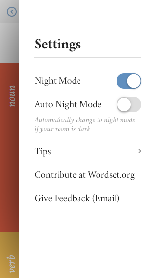
We wanted to look sophisticated but still approachable, friendly but not too playful—subtlety was the key. So while I created the logo with a splash of colors I didn’t carry it over to the interface. The color scheme was predominantly greyscale, almost black and white with just a touch of colors used for accentuation—even those colors are not vibrant but muted. Since a dictionary is all about reading I maintained enough contrast throughout the site and app. To give a classic feel I used Crimson, a serif typeface.
Designing the mobile app
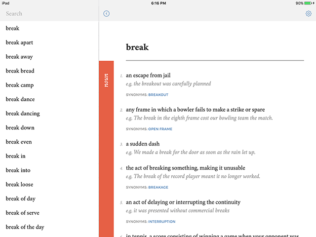
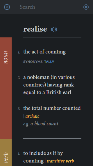
Usually people refer to dictionaries when they’re amidst some other work, mostly reading a book or a newspaper; they rarely open a dictionary and start reading word by word. So, it’s very important that the interface gets the job done as smoothly and quickly as possible and leave people to their main tasks. So, I kept the interface very minimal.
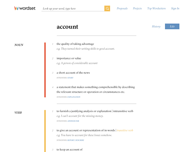
To make it a little more interesting I pulled out the parts of the speech from the main flow and changed its orientation and added a colored vertical rule. The rules clearly indicates where a part of speech starts and the next one starts, which helps the user to quickly locate the different parts of speech on long pages. To make the UI easy on the eyes I used a lot of whitespace while also being mindful of the content density on mobiles to reduce scrolling.
To communicate the working of the interface to the team I created a working prototype of the entire app in HTML & CSS.
Designing the website
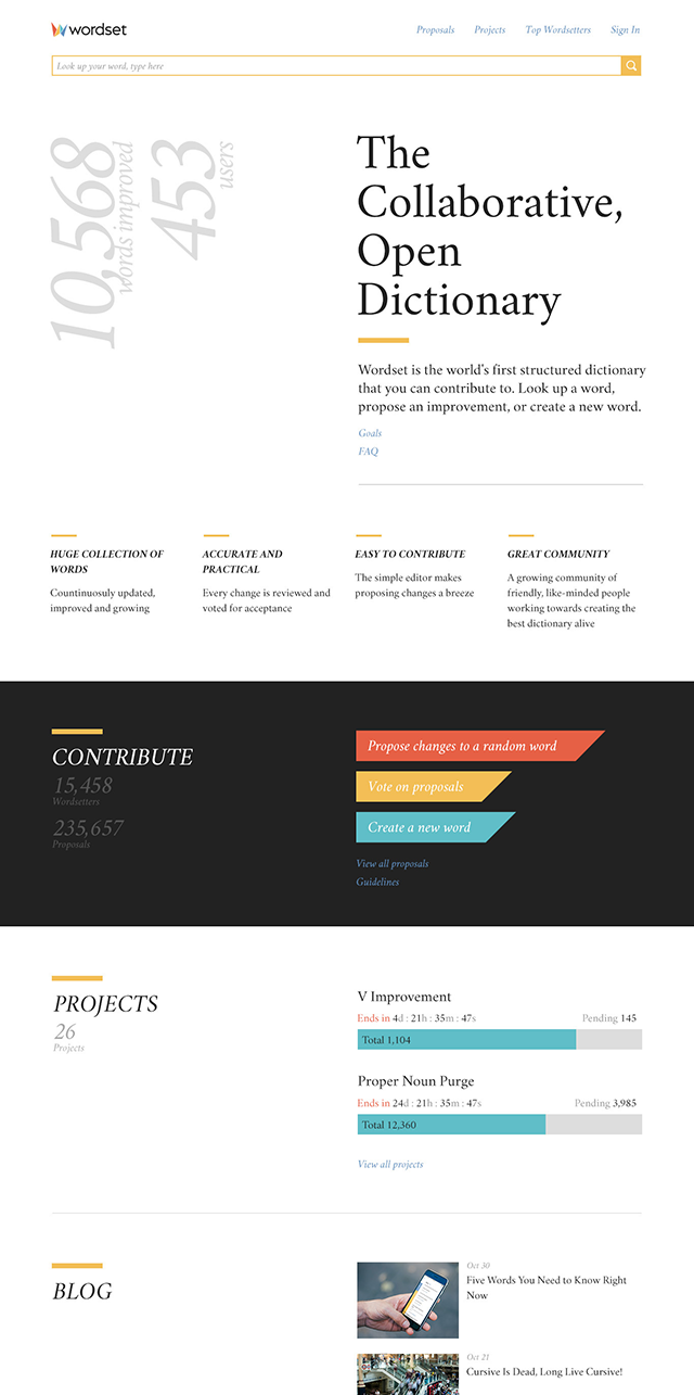
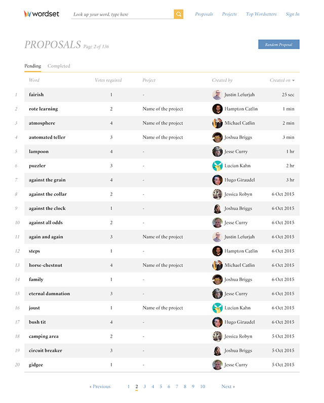
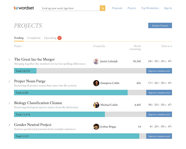
The crux of the website is the collaboration model that allows people to build a better dictionary. Simply put, users propose changes to words and the changes are reviewed and voted upon by other users; once the votes reach a threshold the changes are included the dictionary. The website should make this easy and fun.
I identified three types of users for the website—first-time visitor, people who lookup words and people who contribute. The home page, especially, has to cater to all these three. It has to:
- allow a first-time visitor understand what Wordset is and why he should use it—achieved by the tagline, the description and a brief glimpse of various sections.
- make it easy for frequent word referrers to look up definitions—I gave the lookup box a permanent place in the header.
- allow contributors to immediately jump to the section they want and start contributing—again, he can do it from the header.
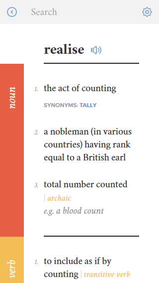
Viewing and editing definitions
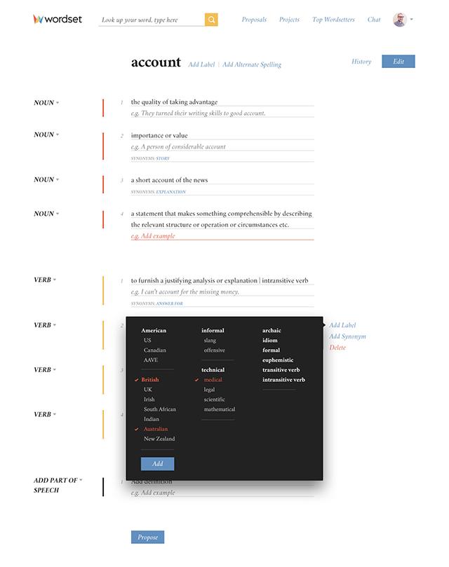
The definitions page closely mirrors the design of the mobile app. If a user wants to improve the word he clicks the edit button and start editing the word. The edit definitions page basically consists of forms. To reduce the friction between editing and reviewing I wanted to make it look as close to the definitions screen as possible. In fact, the definitions being the core content of Wordset, looks the same wherever it appears, across the pages and across the platforms. A consistent design helps people to understand and use an interface quickly and easily. This is also in line with the modular approach of building the website.
The edit actions appear on hover. When a user is done with the changes a proposal is created and gets listed under the pending proposals.
Voting on proposals
This is a page where the contributors would spend a lot of time. The proposal page shows the edits made to a word and allows a user to vote ‘yay’ or ‘nay’.
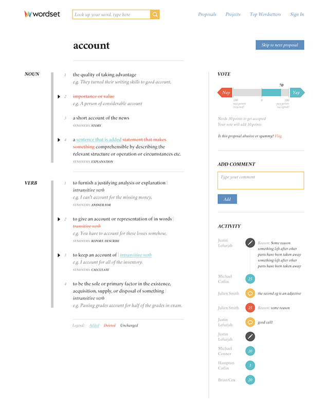
To keep the user in context and avoid cross-referencing between the existing and edited definitions we show the full set of definitions along with edits proposed. On pages with a lot of definitions finding the edits can become cumbersome. To solve this I indicated the edits with an arrow at the left. In addition, I color-coded the edits – additions in green and deletions in red – and to make it accessible to color-blind users I used underscores and strikeouts to indicate additions and deletions. With colors being used to indicate edits on this page using colors to indicate parts of speech could make the page too busy and distracting. So, I removed the colors from the parts of speech.
Making a first-time user understand how the voting system works was challenging. Each user has a vote clout depending on his contribution. A proposal gets accepted when it gets 100 yays and rejected when it gets 100 nays. It’s almost like a tug of war between yays and nays and I used this as a metaphor in designing the vote buttons—the green status bar moves according to the vote and the pointed buttons indicate its direction. The explanatory labels help further in understanding.
A user can also refer to the previous activity on a proposal and add comments if required. I created a timeline to represent the activity more visually, including the comments. This helps the users to quickly understand the reason behind a nay and further discuss about it.
Gamification of Wordset
One of the goals of Wordset is to prove out gamification for collaboration. Gamification is still in its infancy; there is no clear consensus on what works and what doesn’t. What we can be certain is that gamification is not a magic ingredient. We cannot increase user engagement by just introducing leaderboards or badges, definitely not on a long-term.
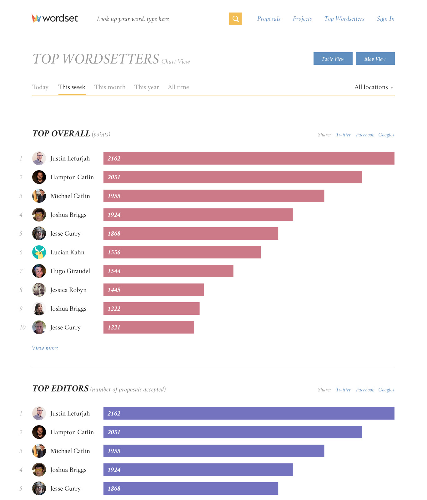
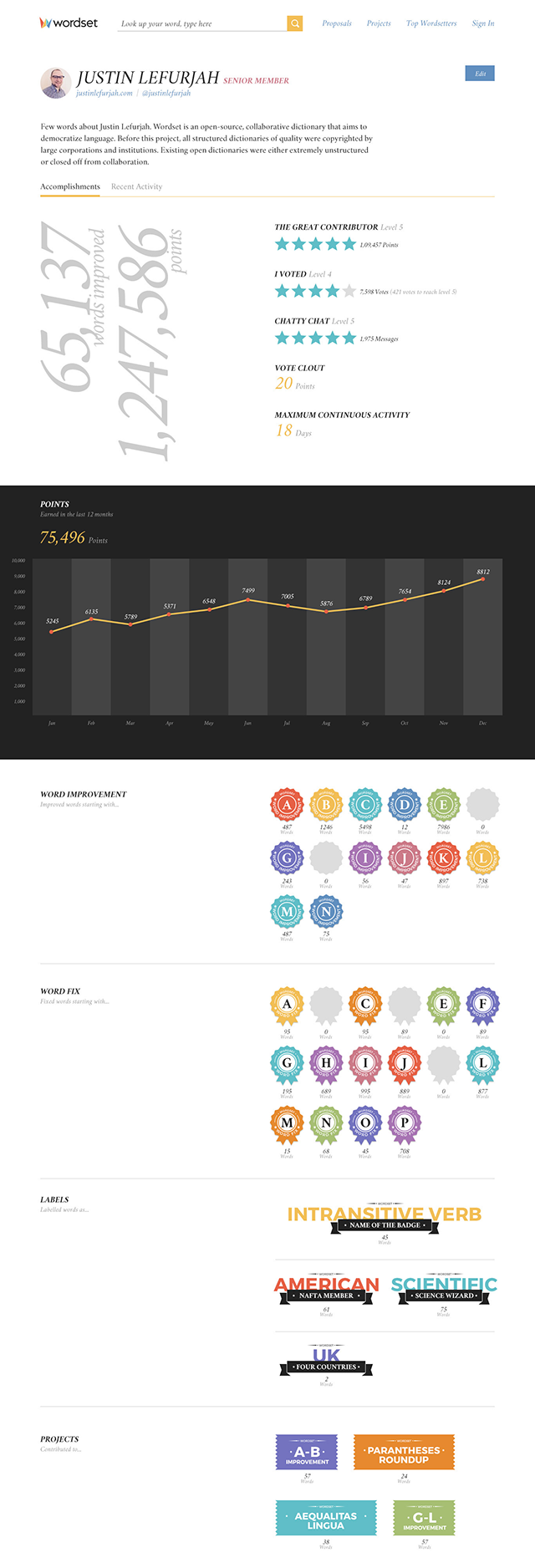
Gamification works best when a product already provides something meaningful to the users—the completion of some activities which in itself gives them pleasure and satisfaction; and over time, a sense of mastery. Wordset has this in it. Wordset’s contributors are logophiles. They contribute because the act of perfecting a dictionary in itself gives them pleasure and satisfaction. So, though Wordset already had some gamification elements such as points, leaderboards and badges I rethought them as an icing on the cake. For example, instead of just giving away points for every contribution and measuring the contribution in terms of points I gave prominence to showing the actual contribution such as the number of proposals accepted, votes, new words, etc.
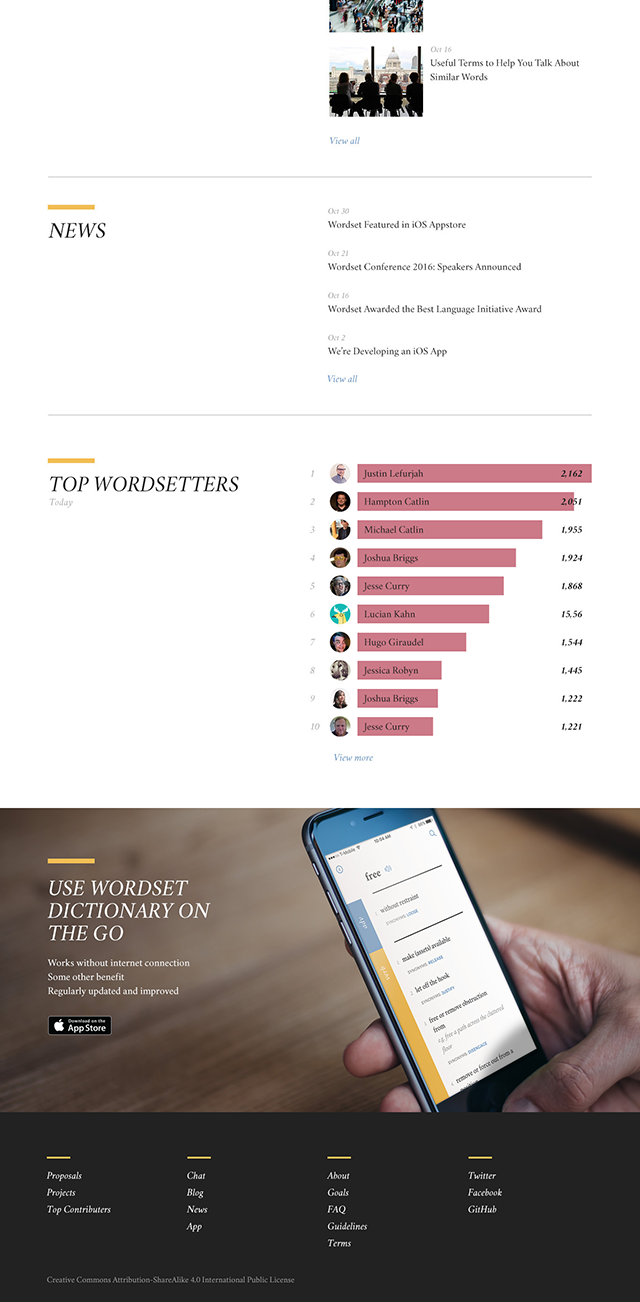
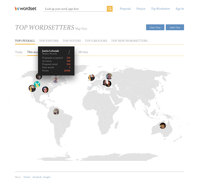
Leaderboards are usually populated with long-term contributors. For new users the task of climbing up the leaderboard might seem impossible and can eventually feel left out. To mitigate this I made the leaderboard more granular. That is, in addition to grouping everything under points I created separate leaderboards for each type of contribution. For instance, if a new user is interested in only adding new words there is a separate leaderboard for him where his contribution is more visible than in the common leaderboard. I also made the leaderboard filterable according to the time of contribution. If a new user contributed a lot on his first day, he has more chances of making it into a leaderboard in the ‘Today’ view. To make leaderboards more interesting I created 3 types of representations—table, charts and map.
User profile is another section where the contributors can showcase their mastery and achievements. I wanted to represent their monthly contributions on a graph to give them a quick picture of their activity so that a comparison between their past and current activities may motivate them to contribute more.
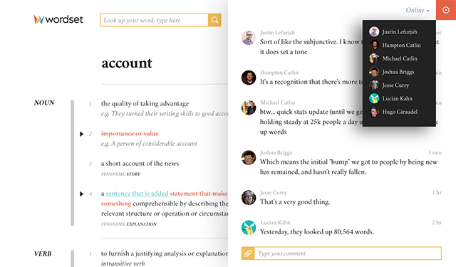
The Wordset Community
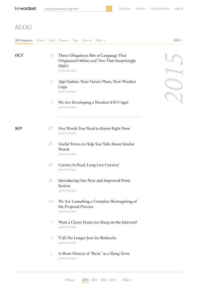
The founders themselves are very active contributors to Wordset. Wordset also has an active blog and a chat where the contributors hangout.
Client Feedback
Wordset has improved specifically in terms of an overall brand and usability. Now, the app and the website have a consistent theme that could easily be expanded onto other products. Also, the site is far clearer in terms of what people are pushed towards in the flow. Less important features (such as the "flag" button) have been deprioritised to make it easier for people to navigate the site on their first visit.
The feedback cycle was great and efficient, with Rakesh listening to us in the logo design stage, and also the final stages of implementing the designs on the website. Plus he had great attention to detail when it came to polishing the product and sending us feedback on items that needed to be tweaked in order to look perfect.
I’d say that despite charging a little more than most other people we were looking at, the quality of the work and prompt feedback mean that Rakesh is definitely a superb choice that we do not regret!

