AtticTV
Creating a mobile magazine for niches

Until I started working with AtticTV I didn’t know there is a magazine called Teddy Bear Times. Many of us love teddy bears but there is a subset of us who are so passionate about them that they need a regular dose of news, pictures and trivia about teddy bears.
There are many such niches. Not all of them have their own teddy bear times but only those dogged enthusiasts, scattered across the world wide web, posting their thoughts and shots. What if a magazine could be made out of this scattered content? That was the big idea of AtticTV. They wanted to create an app for each niche, a single point source of anything related to the niche, which delivers content to people instead of people having to seek it. And, they wanted to create a community around these niches where like-minded people can hang out.
AtticTV started this with Korean Pop (KPOP) and planned to expand to other niches. They had already got 30 KPOP apps, one for each artist, in Google Play and 20 apps for other niches. Now KPOP is not an obscure niche; the KPOP artists have got millions of fans and the apps have got hundreds of thousands of users. The users use the apps to read news about their favorite artist, listen to music, read lyrics, watch music videos, track the artist's schedule, buy related goodies, etc.
The immediate higher level goal was to completely redesign the KPOP apps to allow the users to consume content pleasurably and take part in the community. Having come this far without a dedicated designer AtticTV wanted to create a solid design foundation that can be applied to all of their future apps.
The biggest constraints were that the design should be approachable by the hundreds of thousands of existing users; the design had to be neutral enough to be applied to any niche; the design should get out of the users' way in consuming the content.

Features and functions
The heart of the app is the content feed that includes articles, image galleries, video clips, tweets, facebook posts, merchandise, etc. The content is culled from a carefully curated set of sources including news websites, blogs, social media and ecommerce websites. There is a favorites section, discussion board, shop and lyrics section.


The state of affairs
The AtticTV team had already done some user research, created personas and did some online user testing. I went through them and got a good idea of users’ needs. I familiarized myself with the existing app, got a feel of the experience and took note of what works and what doesn’t.
I did a heuristic evaluation to see how good the existing design is and found a lot of room for improvement. Following were few of the areas that required improvement.
- The app could be structured better for a more intuitive experience.
- The visuals could be revamped. Though the light type on dark background suits millennial KPOP fans it mightn’t suit every other niche.
- The cluttered visuals take the focus away from the content.
- The ad module was separate and got in the way of the users. They could be brought into the feed just like magazines, which would simultaneously make them more visible and less intrusive.

Building the app structure
App structure is how information is laid within a screen and across the screens and how the screens connect together. A solid app structure forms the basis of good user experience. It enables the user to understand the app and makes it easy to get things done.
The first step towards a good app structure is prioritizing the use cases. I created a use case diagram that laid out the tasks a user can do using the app and categorized them into three priority levels based on their importance and the frequency of usage—high, medium and low. Consuming content was the highest priority use case and a close second was taking part in discussions.
Android users are familiar with the Android’s standard navigation patterns. I had to map the information architecture of the content with the Android’s standard app structure as much as possible.
The app’s content had four levels of hierarchy:
- Top level Sections (Feed, Discussions, Favorites, etc)
- Categories of the content
- Content Listing
- The content (Articles, Music, Videos, etc.)
I used the navigation drawer for navigating between the top level sections; spinner for switching content categories and tabs for switching between the most used sections, the feed and discussions.
The Android design guidelines recommends placing the settings in the action overflow menu but it makes more sense to consider settings as a top level section because it affects the app globally. I reserved the action bar only to actions that can be taken on the content on the active screen.


Modular Layout
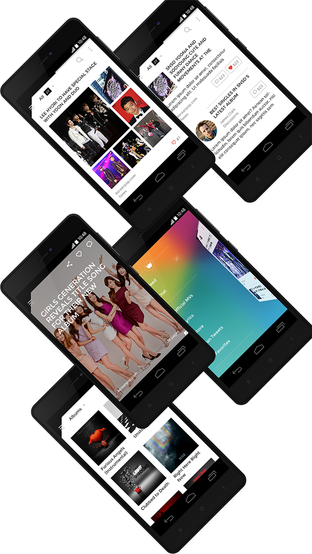
Aiming for a magazine style we made the pages flip rather than scroll. I wanted to make each type of post in different size and style so that there will be enough variation to keep the feed visually interesting. Also, by this way a user could identify each post just by looking at it, which would allow me to remove the post-type tags and thus de-clutter the interface. Flipped pages means the size of each page is fixed. This allowed me to create a vertical grid with 4 rows and distribute the content over one or a combination of rows.
However, I came across a snag. The feed is arranged reverse-chronologically and it’s important to maintain it. In the four-row grid each photos post would occupy 3 rows and what would happen if there are two consecutive photos post? Each would occupy 3 rows leaving a blank row at the bottom, which might make the user think they’ve reached the end of the feed. So, finally, I went with grid with 2 rows. That is, each post would occupy either a half or full page. Still I maintained the variation in post layouts. For example, a photos post would take upon either of the following layouts depending on the number of photos in it.


Another way I proposed to make the feed interesting is to use dark background for some items. Here are some of the concepts – some funky - I created and discarded because they are not very usable and not suitable for all niches.


Interaction and navigation
Though we went with page flips, to accommodate for the fluid nature of digital content, I didn’t force the magazine-page metaphor across all the sections of the app—while flipping worked well for the news feed, scrolling suited better for the Discussions section.
To increase user engagement I prominently placed the favorites and discussions button throughout the feed. We provided an ‘unread’ counter to keep the user informed of the remaining new content.
People use the apps primarily for consuming content and so it makes sense to land the user on the feed on launch. The next frequently used function is discussions.
We wanted to make moving between the content and discussions quicker; so, I used tabs. But a tab takes away valuable space that could be used for the content, which is all the more important because the primary purpose of the app is to deliver content. So, I proposed showing the tabs first and hiding them on the first swipe because once the user knows the swipe gesture he need not have to see the tabs all the time.
Visual Design
We wanted to create a visual style that is beautiful, allow the content to shine and be universally applicable to any type of content.


AtticTV had their branding in place—a set of bright colors for each artist and a hexagonal logo. I wanted to bring the branding into the app non-intrusively. So, I used it to add visual interest to the navigation drawer, which is an important section but one that doesn’t have any long, readable content.
I introduced some small design quirks to differentiate our app from the rest; The black triangle at the top left made the screen looked like a dog-eared page and reinforced the magazine metaphor.

Building, testing and iterating
I created detailed specifications for few screens and the developers took it from there. I created all the icon and images assets required for the app in 4 resolutions.
I created detailed specifications for few screens and the developers took it from there. I created all the icon and images assets required for the app in 4 resolutions.
Once we built the app we did some online user testing and found that apart from minor hiccups the users were happy with the design and completed the tasks effortlessly. I made note of those hiccups and proposed tweaks to address them.


Client Feedback
Rakesh worked with us to design the new UI for our app. He’s extremely professional and a joy to work with, he knows his way around the patterns and behaviors for Android apps and users, despite this being his first Android project. Most importantly the end result is phenomenal and our users loved the new design. That says a lot about his dedication and passion for his job, Rakesh is simply awesome!
In terms of design execution, Rakesh is one of the best designers I have worked with. He deeply considers how the users interact with his designs and has solid reasoning behind each design decisions he makes. He is also quick and the quality of his designs are just excellent. He also has a keen eye for visual beauty and his documentation is detailed that developers have no problem understanding and implementing his designs

