uDebug
Designing a coding tool and a platform for competitive programmers

Programming as a sport is on the rise. Many big organizations such as Google and Facebook host programming competitions in which contestants throughout the world participate. In a programming competition a contestant has to solve a given problem by writing a program in a popular programming language. The program is then run on test data and is judged based on the correctness of its output and its efficiency. If a program is wrong the programmers are neither notified of what exactly was wrong with their programs nor were they shown the output of the correct programs.
This is where Vinit Shah, the founder of uDebug saw an opportunity to help upcoming competitive programmers. He created uDebug as a tool that helps these programmers practice their programming skills by solving problems from previous contests. uDebug contains solutions (that is the correct programs) to the problems and for any given input it gives the output of the correct program. Users can compare their output with this output and use it to debug their programs; hence the name (Yo)uDebug. A year later uDebug developed into a community where users can contribute programs, inputs/hints and chat with each other; the tool is still a central part of uDebug.
In the first version of uDebug I designed its logo and a website that allows users to easily search for problems from UVa and use the tool to check their solutions. Later I established a brand and designed the expanded website that now has solutions for problems from many programming competitions and supports user-contribution and few more features.
Designing the logo
We wanted to create a simple logo that is catchy, recognizable and fun. After trying out few concepts all representing the geeky nature of uDebug in some way, we narrowed down to a bug moving out from the logotype, to indicate debugging.
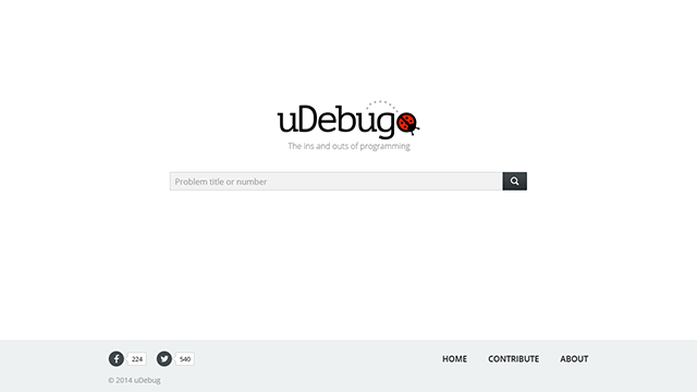
Designing the first version of uDebug
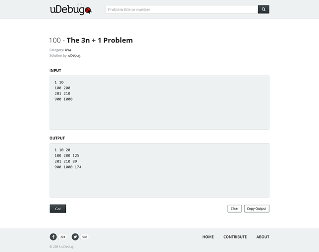
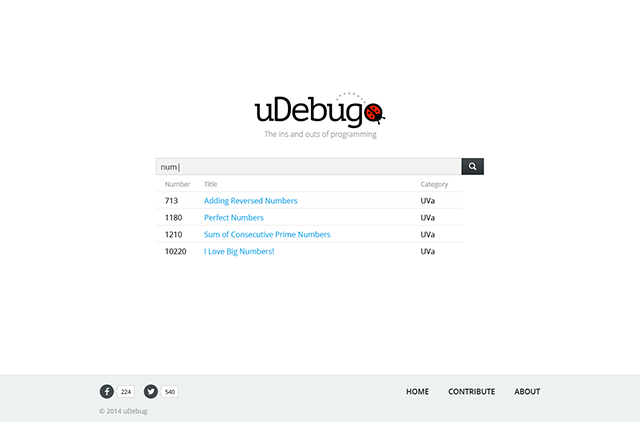
The programmers would seek the help of uDebug when they are amidst solving a problem. They already would have the problem in their mind and the easiest way for them to find it in uDebug is to just type the problem number or name. So I made the home page as minimal as it can get—just a search bar. To make it further easier, the search results would instantly appear as the user starts typing. The problem page was simple too, just with an input and output field and the action buttons. The site was well received by the users.
Re-branding
Initially uDebug hosted solutions mostly from the founder and from few others that were contributed to him via email. The response was great and more programmers started using uDebug and more were willing to contribute solutions and help—a community was forming around uDebug. To facilitate them better we embarked on a redesign and with it a rebranding.
A community is where people like to hang out. I wanted to create a brand that makes them feel at home. Programmers live by their code editors. And nothing speaks ‘tech’ like a dark color theme. All these inspired me to create uDebug’s current look with steel-grey backgrounds and color-studded monospaced type; the founder and the community immediately liked it.
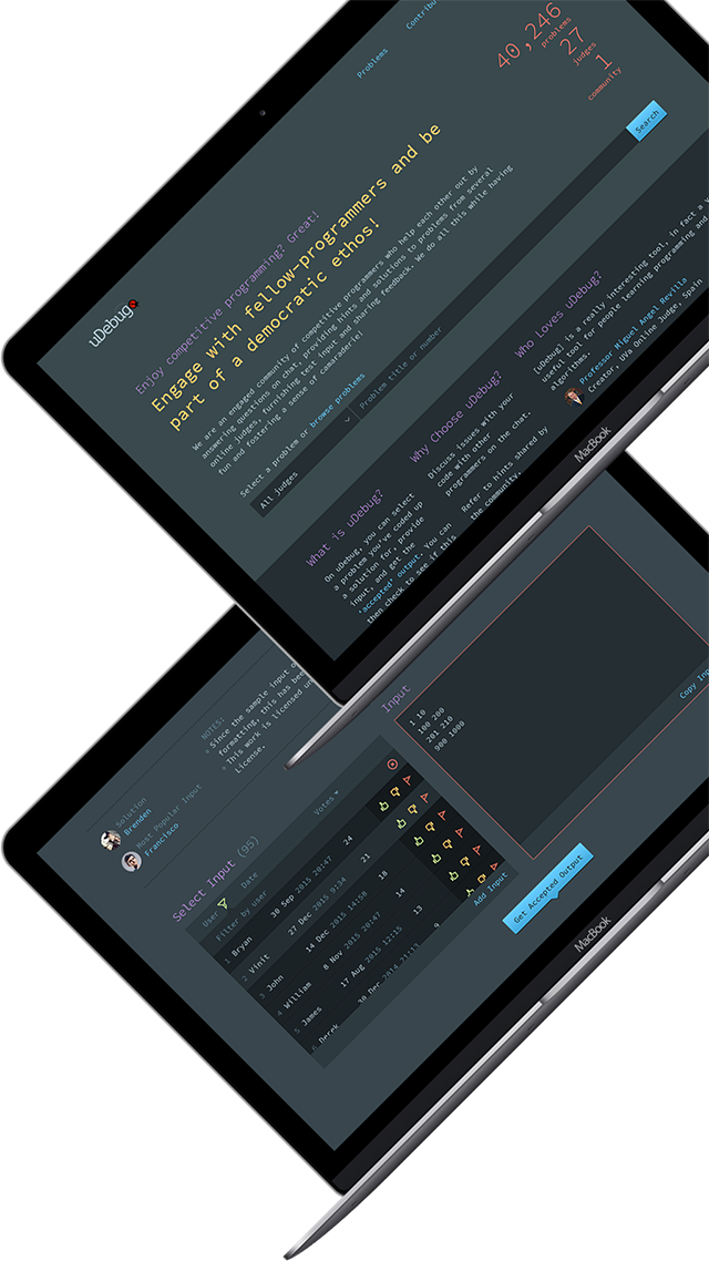
Designing the expanded version of uDebug
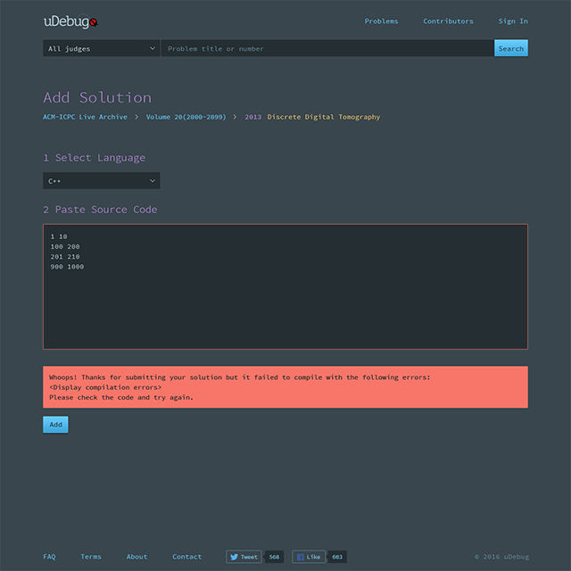
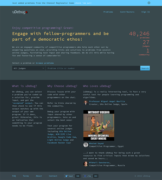
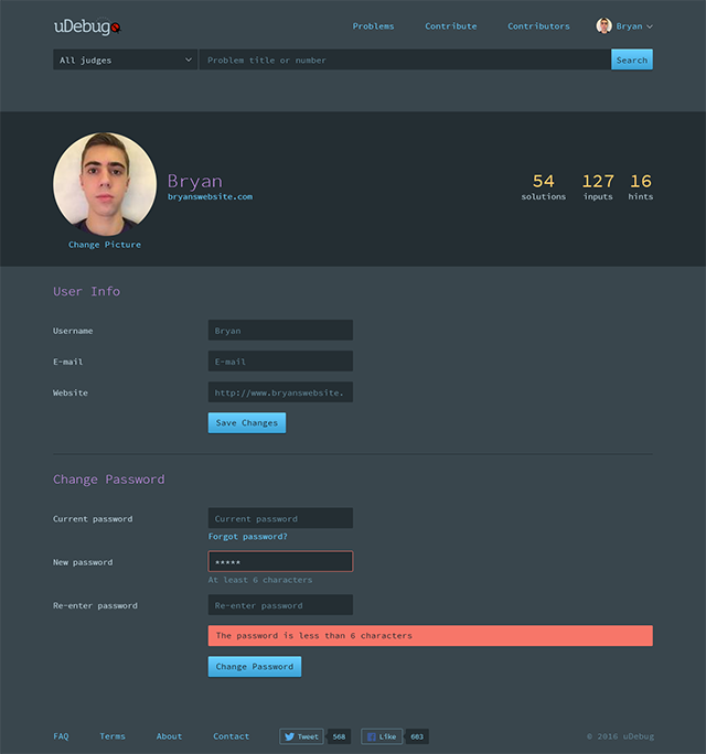
In the revised version a user can either search for a problem or browse the categorized problem sets. Carrying over the simplicity of the previous version we kept the home page short and yet informative. Search still being the primary means of finding a problem I made it available on all pages, under the header.
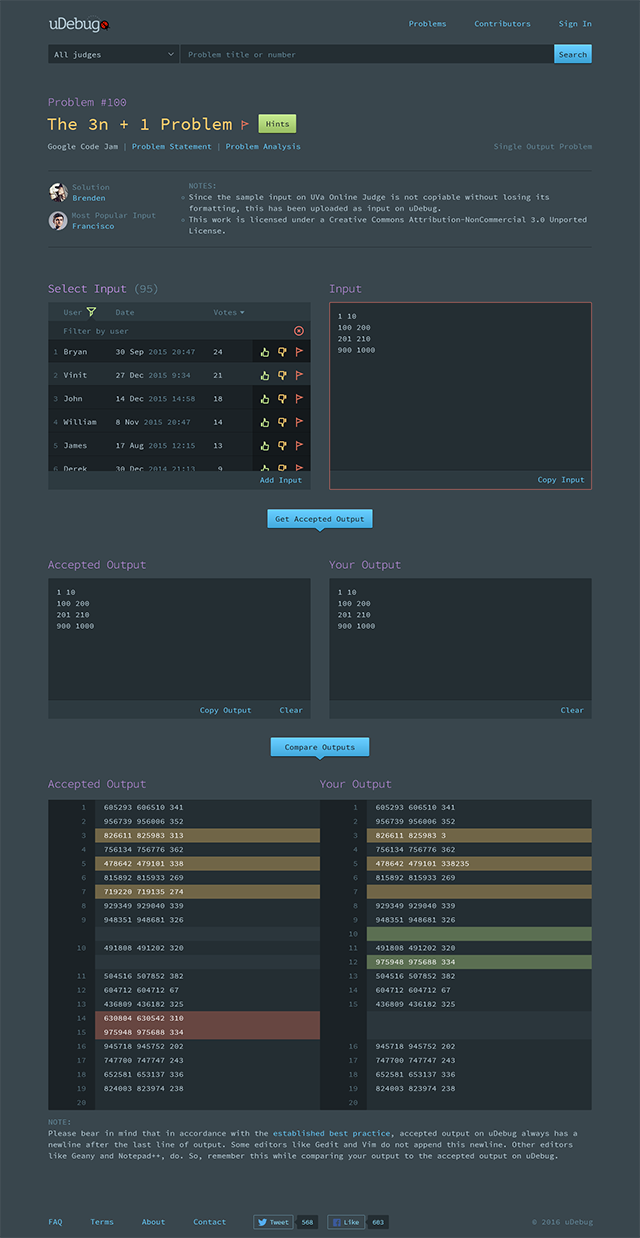
Throughout the site I made user contribution more visible. For example, in the browse problems page, instead of simply listing the problems I included two additional columns ‘solution by’ and ‘most popular input’. This way we give contributors their due, let other users know if a problem is missing a solution and contribute it and motivate more users to get on the ‘most popular’ columns.
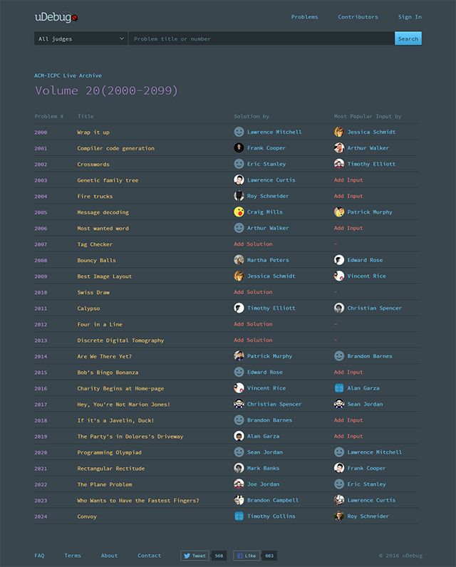
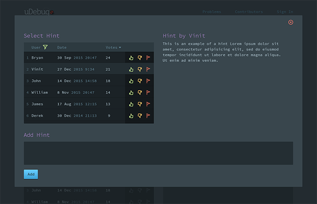
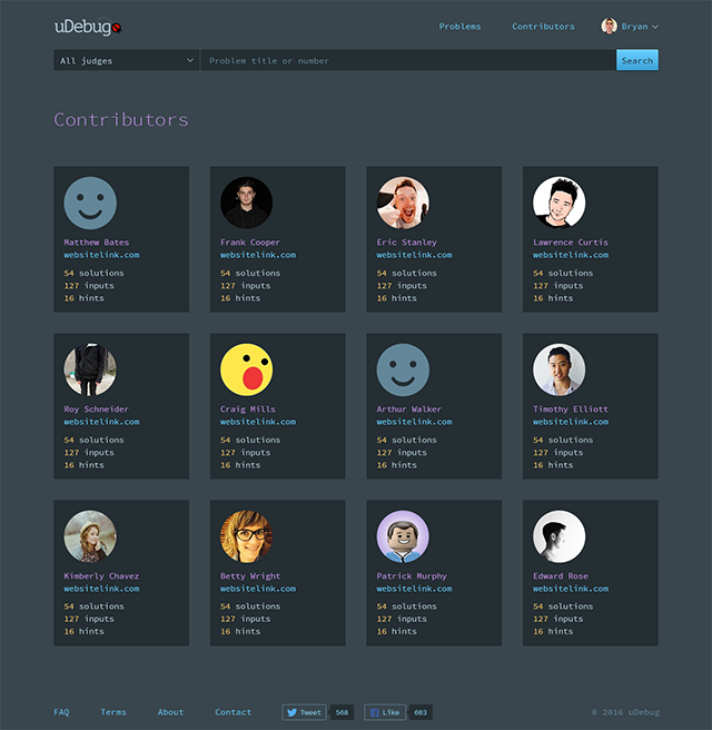
We also created a contributors page and to stick close to the community aspect of the website we didn’t limit it to only the top few; we listed all of the contributors ranked by their contributions.
Client Feedback
I’ve had the pleasure of collaborating with Rakesh for the past two years on a couple projects. The one we’ve spent the longest time working on is uDebug.
Right at the outset, I was sure that I needed an excellent designer to breath life into a very technical website - and I’m happy to report that Rakesh has excelled on this front. We started out by creating a logo - for which he provided a generous number of designs (many more than he promised, actually). Then we proceeded to rev through the wireframes and actual mockups. Because Rakesh is so good at what he does, it required just a couple versions before I was fully satisfied with what he provided.
Over the past year and a half that uDebug has been up, I’ve received a continuous stream of praise. People who provide feedback love the simple and elegant design. Again, this is a true testament to Rakesh’s abilities to appeal to a very diverse and global audience.
Rakesh is also straightforward to team up with and his communication is an asset. He lays out his expectations clearly early on - and will revisit them at his discretion if required during the project. So it’s important to understand these so that you know what’s expected from both parties upfront. If you are someone who is not necessarily ready to invest as heavily on design as on development, then look elsewhere.
In summary, I’ve enjoyed - and continue to enjoy collaborating with Rakesh and am excited to see where his designs will take uDebug!