The case of big phones and one-handedness
Big devices are on the rise; it seems people after all are crazy about them. What some of these people don’t know when buying one, and find it later to their dismay is that they can’t always use the device one-handedly. While some may know it beforehand and still go for it, who wouldn’t like to have the cake and eat it too? What can we designers do about this?
Bottom Controls
The solution that immediately comes to mind is to keep the controls within the reach of the thumb, that is at the bottom. Here’s an example:
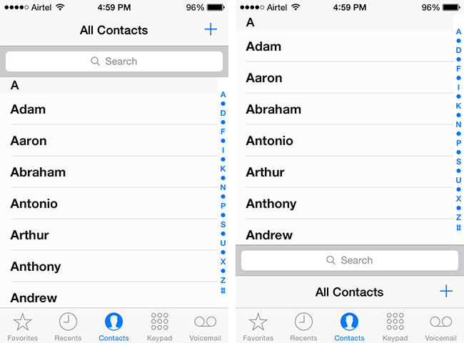
It looks ridiculous because we are so used to the existing layout with titles, search bars and controls at the top. They’ve always been at the top in desktops for decades and mobile followed suit. It’s difficult to unlearn 7 years of touchscreen learning and no phone company is going to risk it. So whatever changes we come up with has to be gradual. How about this:
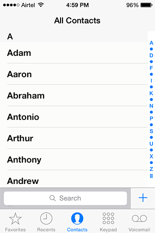
It’s slightly better but still abrupt and cluttered. It seems bottom controls could work better in cases where you have a single menu button with no tab bar, like in Luke Wroblewski’s example.
Or else, we can leave everything as it is and use a trackpad:
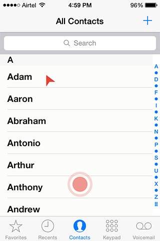
Ok, I was kidding. Touchscreens are more intuitive and engaging than desktops because we work with the objects directly, not through a cursor. Trackpad takes us back to cursors. But who knows, one day an app developer might use it, people might find it easier and it might get viral.
Gestural Control could be a worthy alternative
Gestures are easier and quicker than point-and-click actions. They have the potential to reduce the burden of big screens if not take it off completely, at least in simpler apps. I could think of two methods of using gestures.
Method 1
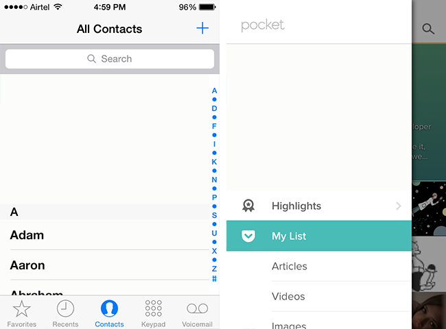
The screenshot shows Pocket’s menu. The symbol besides each entry is a visual cue of the gesture that’d activate it. For instance, if you want to go to Articles, draw ‘3’ anywhere on the screen.
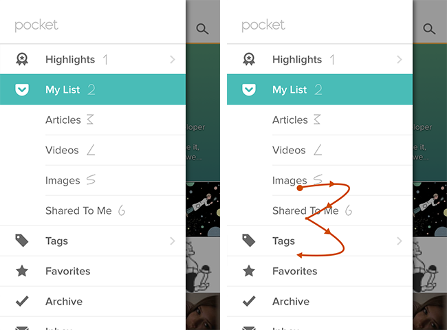
The biggest advantages of this way are,
- you don’t have to remember and recall a gesture because the visual cue is in plain sight
- you can map gestures to any number of actions, anywhere on the screen.
The biggest disadvantage is that it clutters the screen with unintuitive symbols.
That brings us to the next method
Usually the controls you see in the navigation bars of most iPhone apps (at least the inbuilt apps) are: Back, Edit, Add, Done, Delete, Search and Action. Let us say we have a gesture for each of these actions, something like this:
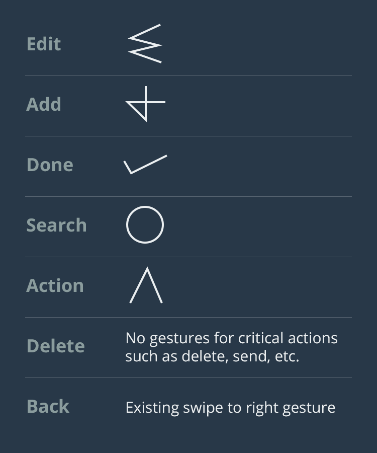
Now take our Contacts screen. It has got three difficult-to-reach controls:
- Add
- Search
- Top few entries of the Contacts list
The first two can be solved with gestures. Draw ‘Add’ gesture anywhere on the screen to add a new contact and search gesture to you know what. Note that the Add icon and the Search Bar are still there because they 1. serve as input for those who use both hands and 2. aid in discoverability of the app.
The biggest disadvantage with this method is that to use a gesture the user should do it without thinking. This can happen only when the gestures are standard across all apps, devices and OSes. This is best implemented by the OS manufacturers. In case they don’t the app makers could resolve to create a set of standard gestures and use them consistently across their apps. Projects such as GestureKit could play a big role in making it happen.
Ok, what about the third difficult-to-reach control, the top few contacts? Just scroll down the list till the topmost contacts reach your thumb — sort of iPhone’s Reachability but without taking your thumb away to double-tap the home button and with finer control. The same can be done to menus too.
This is by no means a critically thought out discourse but more of a mind dump. I’d be happy if it starts a conversation. Share this post.
Get notified of new posts
I write only when I really have something to say; when I do so I’ll send one email and that’s it; no spam, no bullshit.