How I designed Zsnuz for iPhone
On reading the answers to my question on Quora, What do you want to read in an eBook on UI design, I understood there is a widespread interest in real-world design processes. Having made time for my blog at last, I’ve decided to write a series of posts on my design process. In this first entry I’ll narrate how I designed a funky little app called Zsnuz.
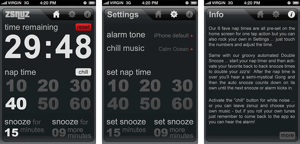
Zsnuz is a nap timer app that allows you set nap time in a jiffy. It has 6 pre-set nap times and 2 snooze times. The times are fully customizable, along with chill music and alarm sounds. It has 3 screens: Home, Settings and Info. A user who wants to take a nap can set the time by tapping one of the six preset times under "nap time"

I’ll outline the general steps involved in UI design and how I went about each step. (To get a good overview of the general steps of UI design refer The Elements of User Experience by Jesse James Garrett)
1. App objective and target audience
The starting point of any app design process is the question: What is the objective of the app and who are its users? The answer comes from the client, Kevin Cohen of Doubleman Media:
My assumption with this app has always been that if a user is going to take a nap, they are already sleepy and don’t want to have to think, or fumble with buttons, set times, scroll through multiple screens, etc.
The users? Anybody who takes nap. That means just anybody from any age group or social group from anywhere around the world.
Each and every design decision I make should be based on this objective and the target audience.
2. Scope and features
Now that I’m clear of the objective, next comes the question, what exactly should the app do? What features should it include?
Again the answer usually comes from the client. Kevin wanted to keep the features minimal and just let the users take their nap. This is very much in line with Apple's application strategy of focusing on few features that matters to most of the target audience. Keeping the features to the core minimum greatly helps to achieve laser focus on the task at hand, which Apple recommends.
3. Information Architecture, Interaction and Navigation Design
Now that I’m clear of the objectives, user and the scope of the app, I’m set to start the design. Now, what is ahead of me? I have to,
- group and organize the information that the app contains into clear, logical screens so that the app makes sense to the users; so that the user could tell what the app does by just looking at it and by moving between the screens
- make the app interact in the most intuitive way possible so that the user could get done with the task with the least effort (that is the product objective, remember?)
Competitor analysis and design inspiration: Before doing anything further I try to get a feel for the designs of similar products available in the market. This could serve three purposes:
- Know if the problem I’m trying to solve has been solved earlier,
- To make the app stand out from the crowd and
- Provide inspiration
I launched Google and searched for timer apps. I didn’t limit my search to iOS apps but extended it to other mobile platforms and the electronic products available in the market such as, timers, watches, clocks, etc.
This stage primes me for the next stage. By this time I have tiny, disconnected ideas bubbling inside my head. Now I have to streamline them into a coherent whole. I leave around 24 hours and then enter the next stage - Brainstorming.
Brainstorming: I guess this is my favorite stage. I just lied down on the bed, closed my eyes and thought, if I’m sleepy and want to take a quick nap and if I have an app that could help me, how would I want it to behave? What sort of design would allow me to use it effortlessly? What is bare minimum set of features that I’d require? How best could it be laid out? Would I want to fumble with small buttons? What if I happen to wake up in the middle and wanted to know the time?, etc. I imagined myself having an app with me and working with it.
One thing I certainly wouldn’t want is to keep switching screens and fumble with the controls. I’d want the app to react immediately. If I want to set a nap time I just want to tap it and go to sleep. If I want to customize the time, again I’d just want to tap it to change it and go to sleep.
A clearer picture emerged. The tiny ideas connected to form a whole picture of the app screens in my mind. I decided the main screen should show the core of the app: remaining time, preset nap times and snooze times. A single tap should start the timer. There should be a settings screen in case the user wants to customize the time but it should look the same as the home screen so that the user needn’t have to think which time to change and where to look for it.
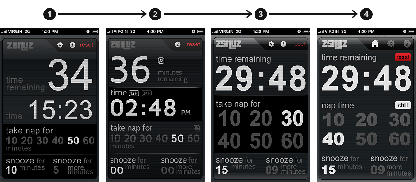
As an outcome of the brainstorming session I thought I should add a clock so that a user could easily know the current time. But later, on adding some more controls pertinent to the clock we found it cluttered the screen and it seemed like compromising the objective of the app. So, I removed it.
4. Interface and Information Design
Now that I was clear of the major architecture of the app and how it should interact with the user, I needed to design the individual screens. I have to
- arrange the information in each screen so that it makes sense to the user
- create the buttons and other controls and place them for optimal use
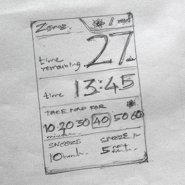
Sketching: I started to put down the ideas into a sketch. Since the basic information of the app is numerals I decided to do away with buttons and other extraneous elements and use type itself as the interface. Being a fan of typographic art I wanted to make the screen look like a typographic poster (but without sacrificing usability). I wanted to utilize maximum space for the content of the app. So, I did away with the tab bar by moving the navigation to the top and to the right of the screen heading.

I split the screen vertically for the timer at the top and the timer controls at the bottom. I interspersed section labels with the content of the sections and made the whole screen look like a typographic poster.
I had a good look at the sketch and thought carefully if I could improve the design any further. I couldn’t think of any and I was happy with the design. So I proceeded to the next stage.
Wireframing: Sketches may not be legible enough to communicate ideas with others. So, I usually create rough wireframes or a blocky UI using Photoshop (certainly not like those pristine sketches or wireframes you see on dribbble). But this app being simple I skipped this stage and directly created a design comp with Photoshop.
5. Visual Design
Going with the style of LED clocks, I made the background dark, created scan-lines and made the text glowing in grey and white. I took care to adhere to the following design principles:

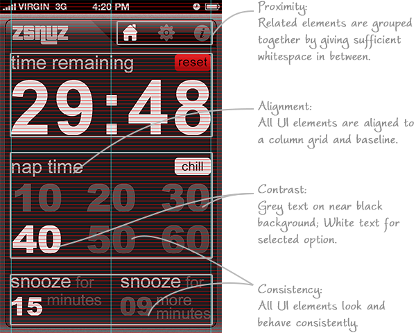
Contrast: I saw that there is enough contrast between the background and the content and also between the selected and unselected options.
Proximity: I grouped all related elements together by leaving enough space between the groups and by varying the darkness of the background (as in the case of navigation bar).
Alignment: This being a typographic UI I gave special attention towards alignment and aligned everything to a baseline grid and a column grid as shown in the image.
Consistency: I guess consistency is more of a common sense; it comes without any major conscious effort. The screens and the elements should look and work consistently. For example, the screen headings are in the same place, of the same size and color in all the screens; The navigation icons are of the same size and style, etc.
Few words about the elements of design:
Font: Trying out various fonts I found Cabin looked good because of its large x-height and character width. But because of the non-uniform character widths some character combinations looked like they had kerning issues. So, I chose good old Arial for its uniform character width and legibility.
Color: Color was used sparingly, to highlight the reset button, which as a bonus added to the visual interest of the design.
Kevin liked the draft and we further refined it to what it is now (shown below).

An important aspect that is missing in the whole process is user-testing. I would’ve loved to validate my reasoning with some user testing but didn’t do so because of time and other constraints. I hope the users find it as intuitive I conceived it to be.
I hope the article provided you with an overview of the general UI design process and a behind-the-scenes look at the actual design process of an app. Share your thoughts in comments.
Get notified of new posts
I write only when I really have something to say; when I do so I’ll send one email and that’s it; no spam, no bullshit.