Bipp
Enterprise-grade business intelligence platform

Bipp is an enterprise-grade, Swiss Army knife of a business intelligence platform that caters to all sizes of business, from enterprises to mom-and-pop stores. It supports in-database analytics, data modeling, git-based version control, a sophisticated content and access management, versatile data visualizations, and much more.
I worked with the Bipp team for 3 years full-time, as the founding designer and took care everything related to design, from the product to the marketing assets. When I went onboard they had built the basic features. I designed the UI from the ground up.

The web app
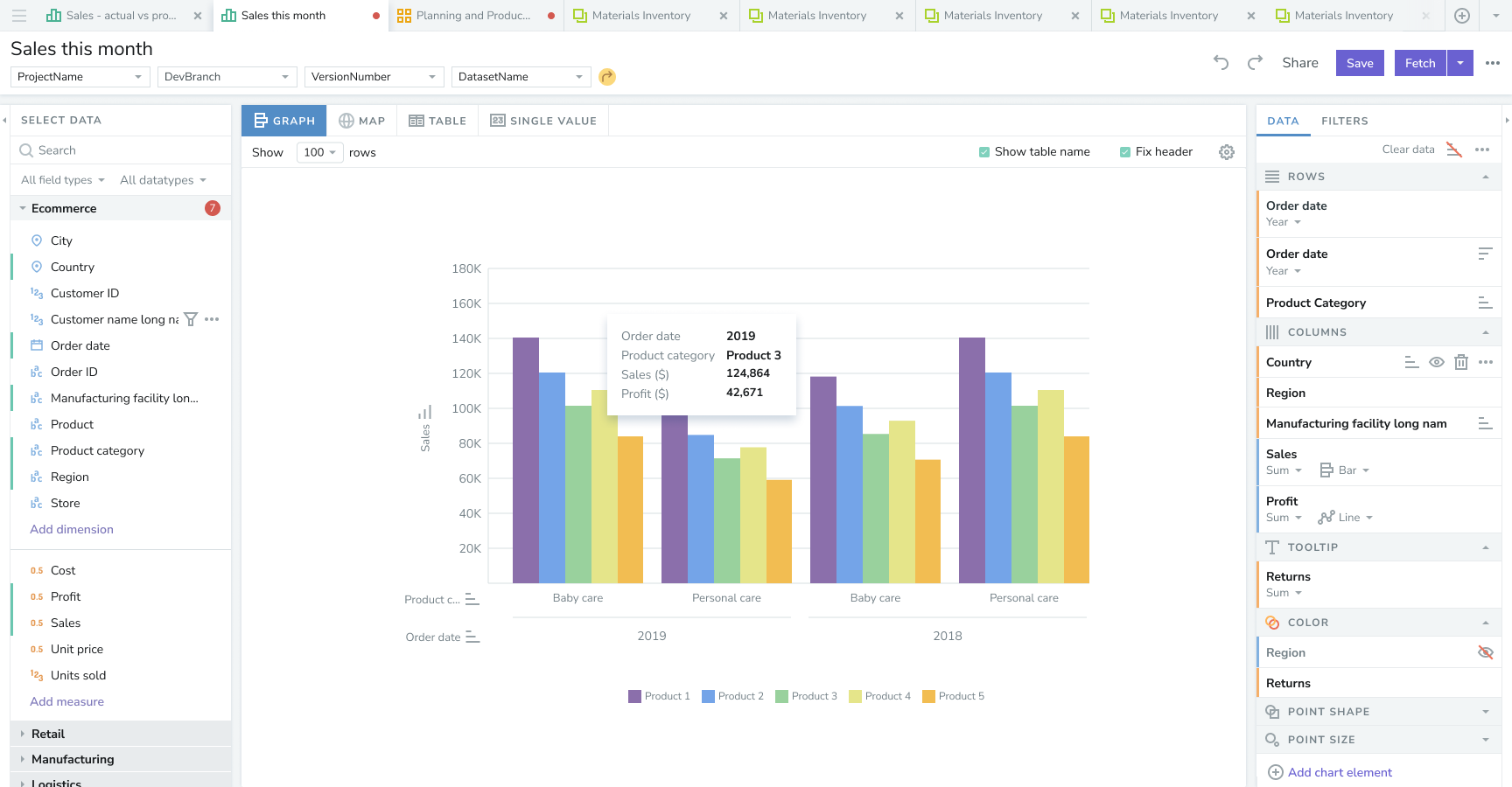
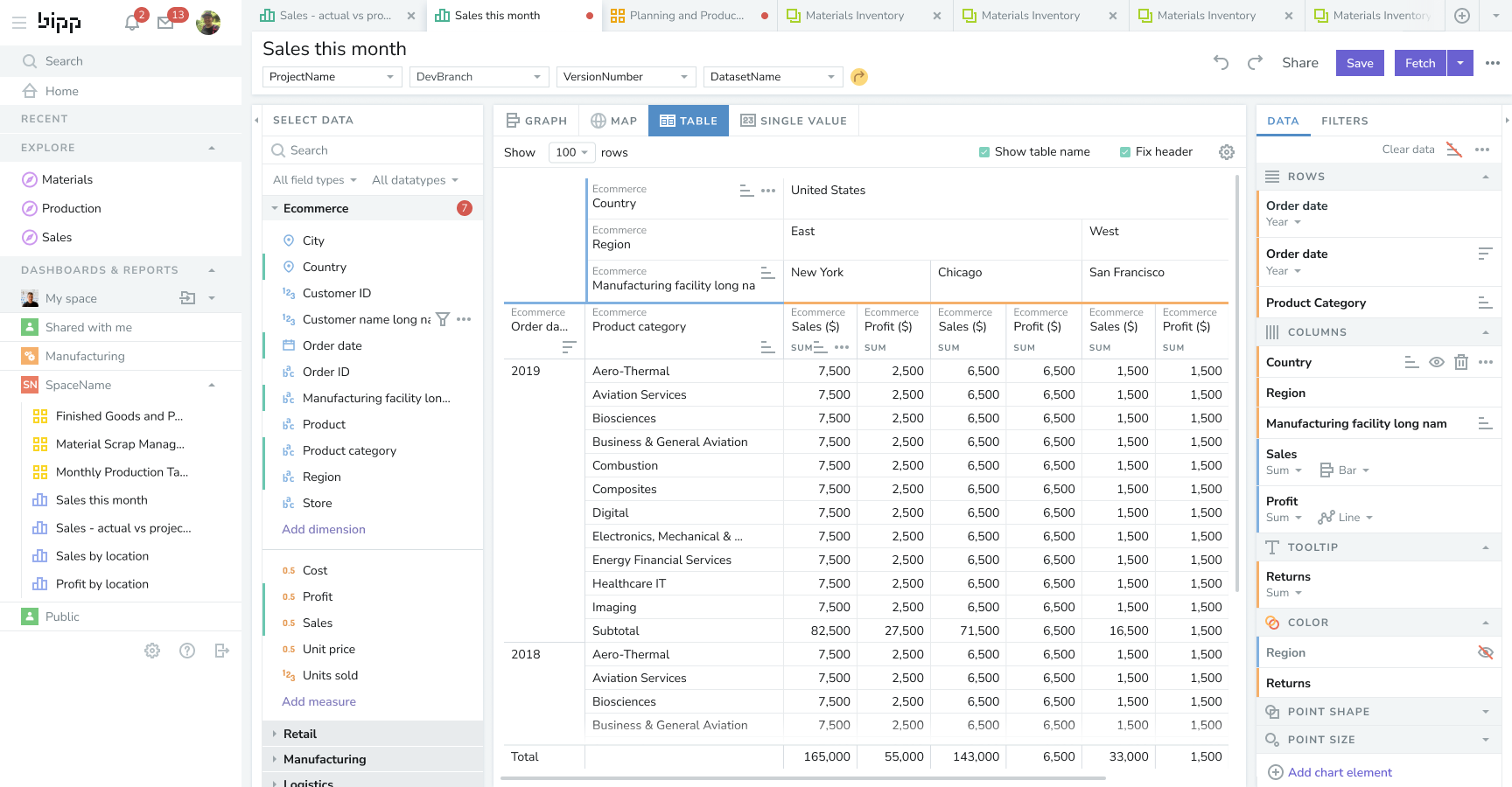
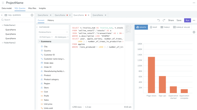
Bipp allows businesses to get insight from their data. A fairly basic use could be, say a retail stores chain owner could see the total sales of the stores for the previous month, and then narrow it down to the sales of a selected store. He could narrow it down further to find the performance of a single product or a product category. Then he could compare it with the sales in previous months. He could view the information as a table or any of the numerous charts (bar chart, line chart, etc.). This is a fairly basic usage.
In large corporations, to whom bipp mainly caters, each organization would have multiple departments, each with its own information of interest. Such corporations have a dedicated team of BI developers who takes the raw data, and create custom combinations of data that is of interest, and makes them available to the business users who in turn use them to on charts and dashboards to get business insights and share them with their teams and management.
Complex information architecture and functions
The sheer number of entities involved in the product made it a joy to design. Just to give a taste of the complexity:
Three types of users
Business users, BI developers, and admins, each with their own functions, data and security requirements
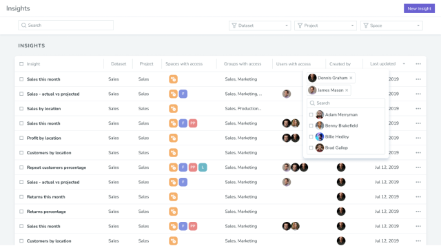
Two types of consumables
Insights (charts and tables), and dashboards that are made up of insights
Two ways to categorize data
categorical and quantitative. Two ways to further categorize quantitative data: sequential and divergent
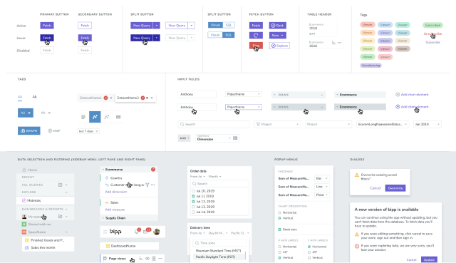
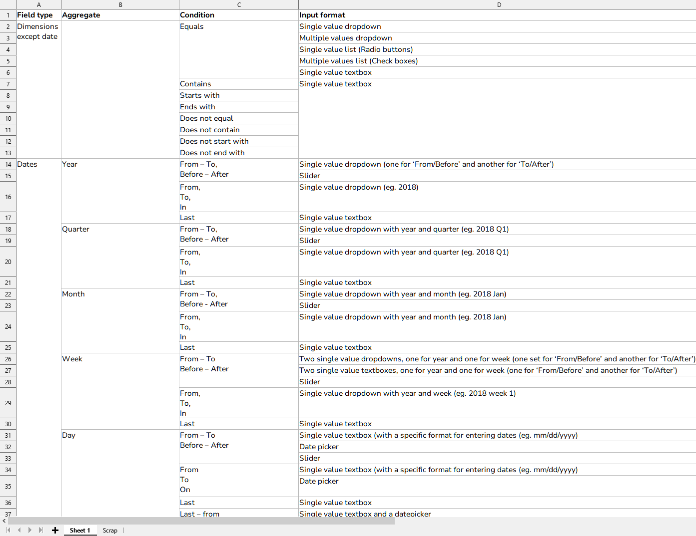
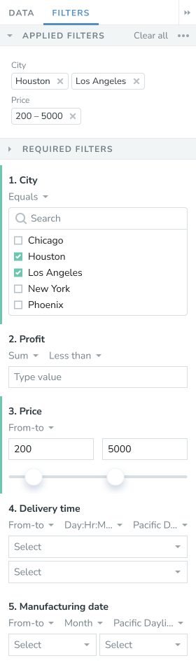
Ways of filtering and sorting
The input format (dropdown, slider, etc.) changes according to the type of data, aggregation and condition. Sorting at multiple levels and axes (pivot tables)
Various types of encoding
Visual attributes used to encode quantitative values (points, lines, bars, etc.); Visual attributes used to encode categorical items (position, hue, point shape, etc.)
Various other categorizations
Spaces - collection of dashboards and insights; Groups - collection of users; Roles - collection of permissions
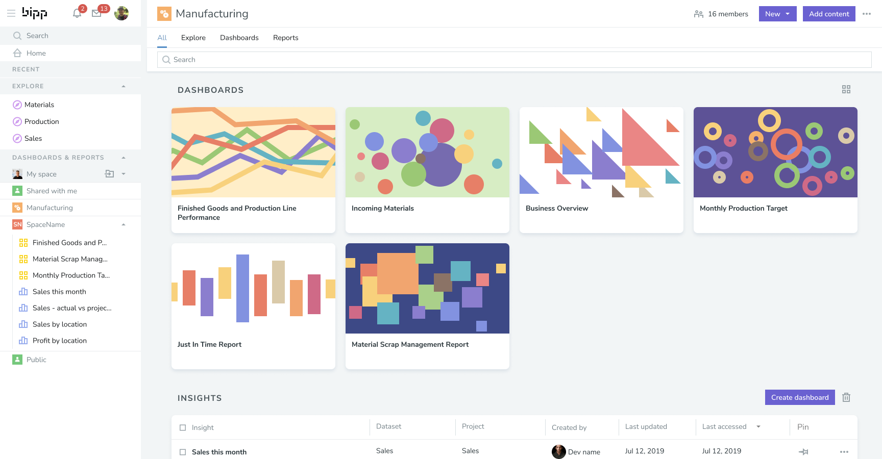
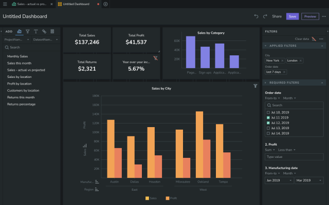
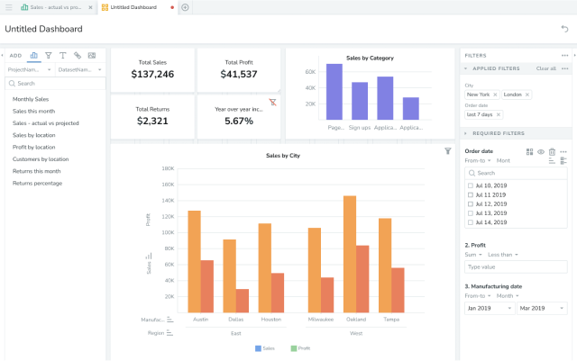
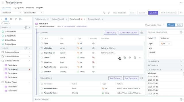
Insights and dashboards, the business user's playground
The workspace for business users. The explores and dashboards are were the business users would spend most of their time.
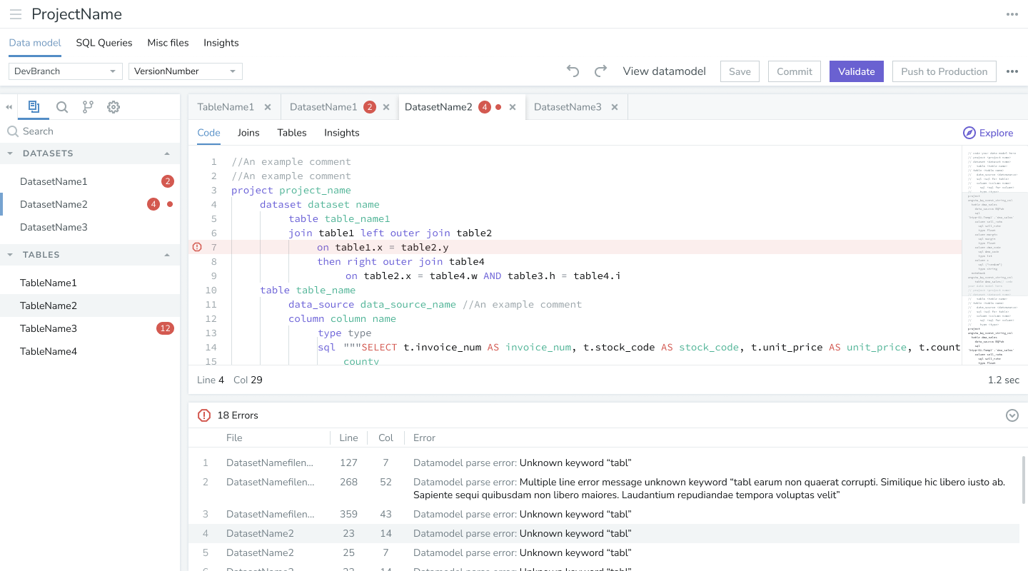
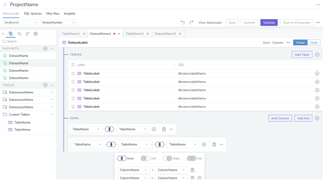
Projects, data modeling and SQL editor, the BI developer's arena
The developers create projects, a collection of database tables, in which they create data models, that is metrics customized to their business.
Sophisticated access control
The BI developers can segregate users into groups, the consumables (insights and dashboards) into spaces. They create roles which is a set of permissions (create, read, edit, delete, etc.). Then they assign roles to each group on each space. In addition there was also the row level and column filters that let them manage access to the database rows or columns at an individual level. All of this makes up for a fine grained, sophisticated access control.

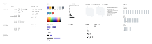
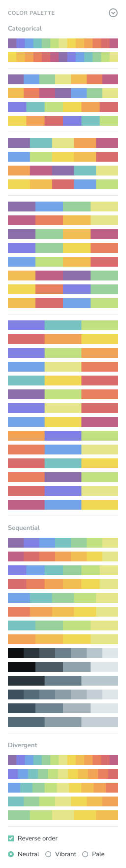
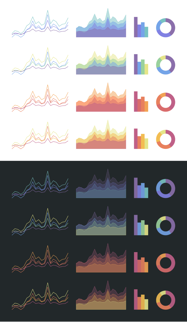
A simple but versatile color scheme
Color is a common way to differentiate one data from another. The primary requirement of colors in a color palette used on charts is that the colors should be distinct from each other so that people can see them as different colors, without confusing one color with another. To add to the complexity, colors are applied on three types of data—categorical (e.g. product categories, cities), sequential (quantity that changes from a minimum to maximum, e.g. sales of a product), and divergent (quantity that changes from negative to positive, e.g. profit).
A dashboard usually contains multiple charts. It would be good to have the colors used on them look harmonious. So, after a lot of experimentation, I created a set of 13 colors that could be used in different combinations to satisfy the above mentioned requirements. The colors work with both light and dark backgrounds, have good contrast between each other, have good contrast with the background color. In addition, it makes things easier for the users to use them and our the product development team to build the color palettes
Website and docs
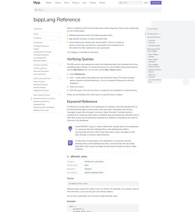
A comprehensive website complete with custom-designed documentation and tutorial pages.
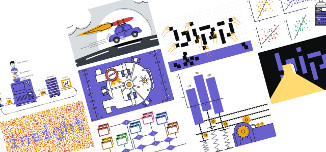
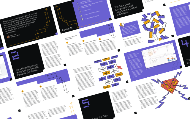
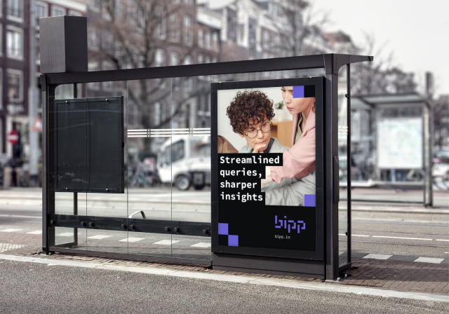
Marketing Collateral
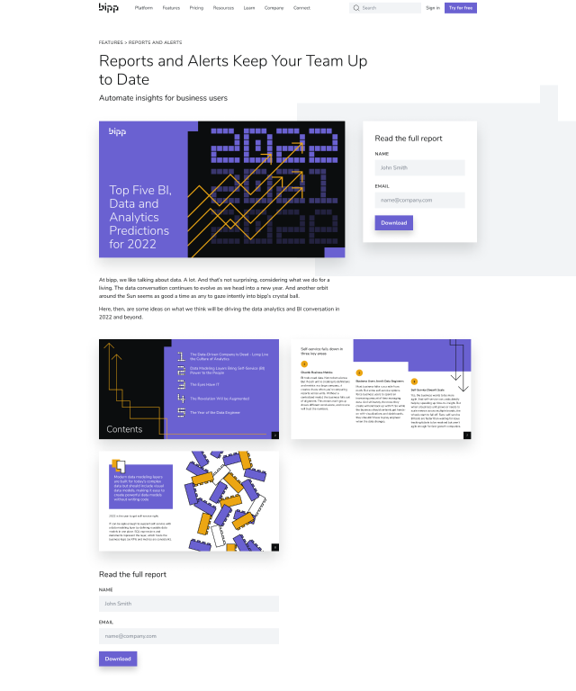
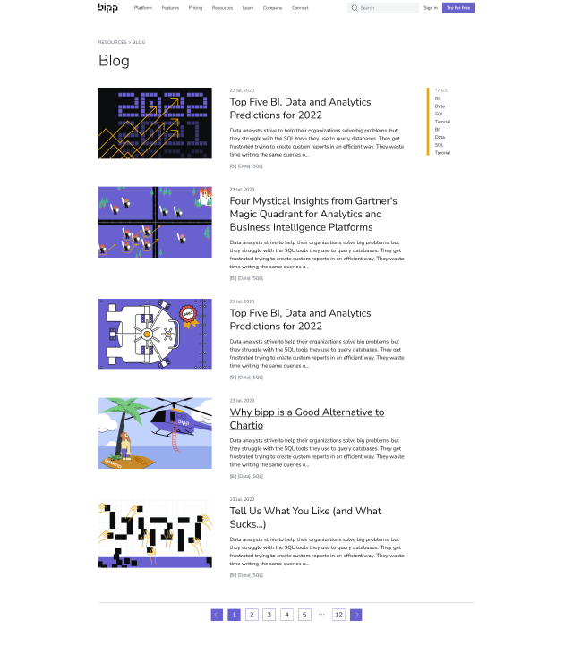
While we had a freelance illustrator to illustrate for the blog I did some of the simpler illustrations. I also created an ebook marketing campaign and the images for twitter marketing campaigns.

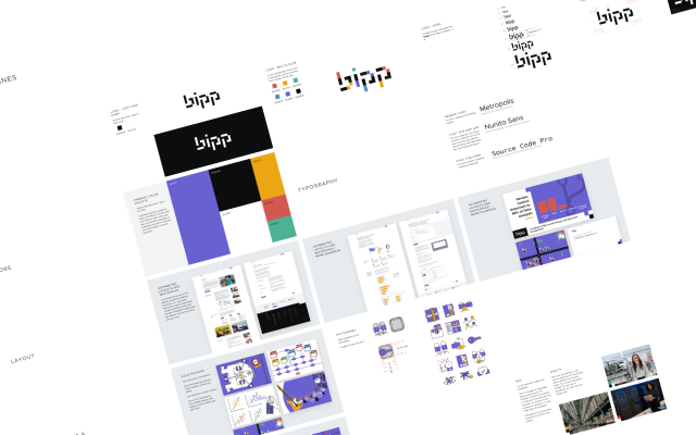
Branding


Design Communication
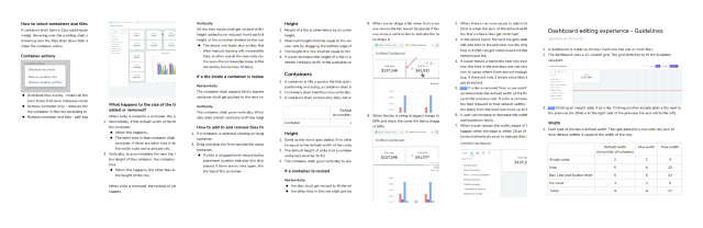
I created a design system for the web app, and communicated the way a feature should work by writing detailed guidelines for the features. I created a style guide for the website and brand guidelines.